To breathe new life into the residence, the owner enlisted Claire Sa, co-founder of the esteemed London-based interior design studio De Rosee Sa, tasking her with crafting the ultimate, hotel-worthy pied-à-terre. Rather than defaulting to the conventional wisdom of keeping small spaces minimal, sparse, and painted in bright white to artificially stretch the square footage, Sa trusted her instincts and opted for a much richer, more immersive approach. The design team felt strongly that the 730-square-foot footprint deserved a layered, deeply textured treatment filled with personality, books, and framed artwork.
The primary objective was to deliver a level of comfort and sophistication that could rival a five-star boutique hotel, seamlessly tailored to the dynamic lifestyle of the traveling owner. Sa sought to achieve a space that felt deeply tactile and curated without crossing the boundary into feeling twee or mimicking a traditional Old World English cottage. Central to striking this delicate design balance was the implementation of sophisticated linen wallcoverings throughout the living room and primary bedroom, introducing a subtle, woven grain effect that standard paint simply cannot replicate. Behind these high-end finishes lies a masterclass in space-planning, optical illusions, and architectural cleverness that completely transformed the petite property.
The Peekaboo Partition
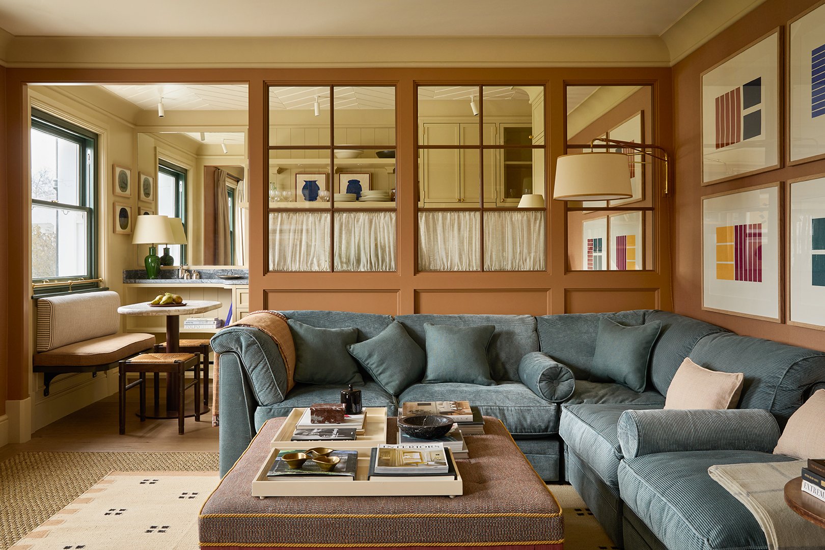
One of the most consequential architectural moves in reconfiguring the apartment involved removing the solid, dividing wall that previously separated the living room from the kitchen. In its place, Sa installed a bespoke glazed screen that fundamentally alters how the apartment flows. Rather than committing to a fully open-plan layout—which often leaves functional kitchen clutter entirely exposed to social areas—the glass partition hints at the expansive volume of the entire apartment while tastefully obscuring everyday items like pots, pans, and food preparation chaos.
The lower portions of these interior windows are partially dressed with charming cafe curtains, adding a layer of softness and privacy. To anchor the room, a custom sectional sofa was specifically designed and proportioned to line up neatly against the brand-new partition. Meanwhile, a particularly clever optical illusion is concealed in the corner of the room: a mirrored panel that functions as a functional disguise. Sa frequently utilizes this technique to hide bulky household elements out of plain sight; in this specific Notting Hill apartment, the mirrored panel cleverly conceals the kitchen refrigerator behind it.
The Groovy Ceiling
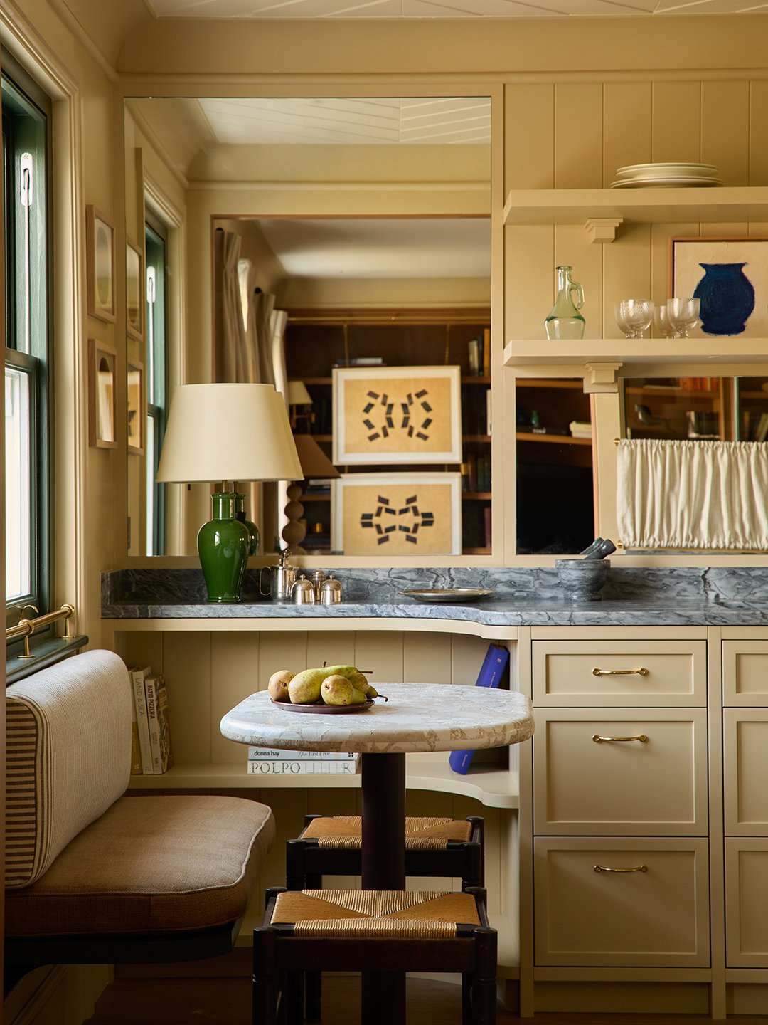
Interior designers often focus exclusively on walls, floors, and furnishings, frequently overlooking the vast potential of the fifth wall. Recognizing this common oversight, Sa deliberately turned an awkward structural sliver in the kitchen into a major design feature by wrapping it entirely in tongue-and-groove wooden paneling. To elevate the visual interest overhead even further, the timber was laid out in a striking chevron pattern—marking the very first time Sa experimented with this specific geometric application on a ceiling.
The Carpet Compromise
Navigating historic or managed London residential buildings often comes with strict bureaucratic hurdles, and this property was no exception. The apartment building’s management stipulated a strict mandate that carpet had to be laid across the living room floor for acoustic dampening and sound-reduction reasons. To satisfy the complex’s rigid regulations without sacrificing her sophisticated design vision, Sa devised a clever compromise. She installed oversized, neutral sisal carpeting that spans nearly the entirety of the room, satisfying the management company completely, while allowing her to layer a chic, patterned decorative rug directly on top.
The Clever Paintwork
Given that Notting Hill is globally celebrated for its lush, verdant garden squares, Sa sought to establish a visual dialogue with the surrounding neighborhood. To maximize and enhance the views of the towering tree canopies visible from the windows, she made the deliberate decision to paint the window frames a deep, rich bottle green. Explaining the optical impact of this choice, Sa notes how standard white window frames tend to keep the outdoors at a distance, whereas dark frames cause the natural greenery outside to pop and pull right into the living space.
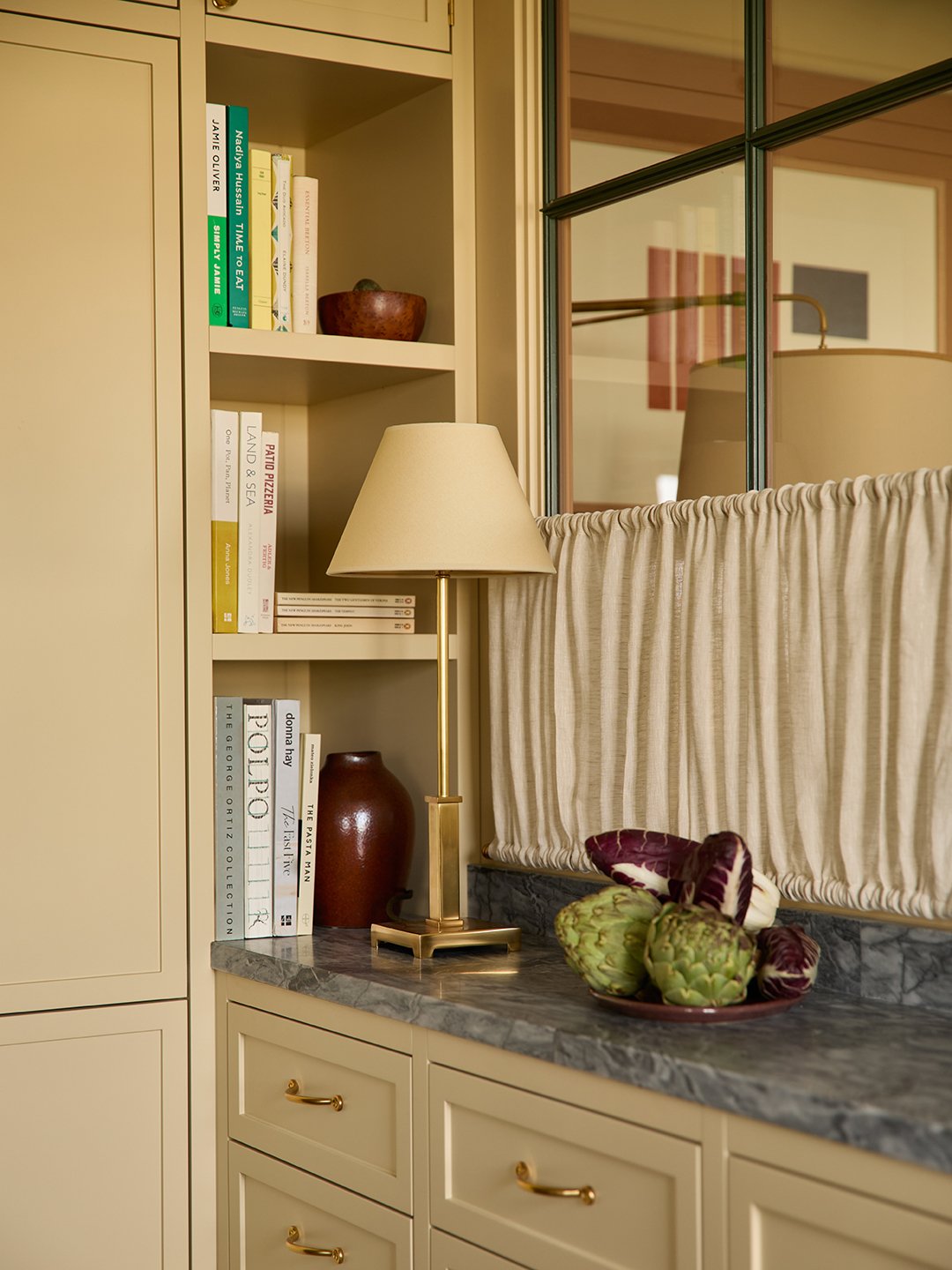
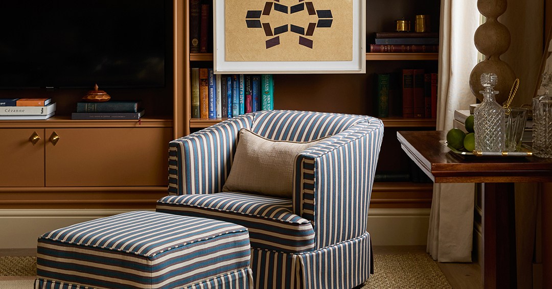
Another subtle yet impactful paint technique was applied to the living room’s custom shelving unit, where the interior backing was painted a shade slightly darker than the surrounding outer frame. This sophisticated nuance ensures that books, decorative objects, and framed pieces stand out against a richer base. A notable side benefit of this darker backdrop is that the television monitor nearly disappears into the background when not in use, reducing its visual weight in the room.
The Free-Moving Art
Hanging artwork directly over built-in shelving is a well-established interior design tactic, but Sa took the concept a step further by installing elegant brass rails above the living room shelves. This addition allows the owner to effortlessly slide, rearrange, and swap out pieces of art on a whim without drilling new holes or committing to permanent placements. In the primary bedroom, framed pieces are left to rest casually atop the mirrored wall treatments, introducing yet another layer of texture to the unconventional wall finish.
The Constant Reflection
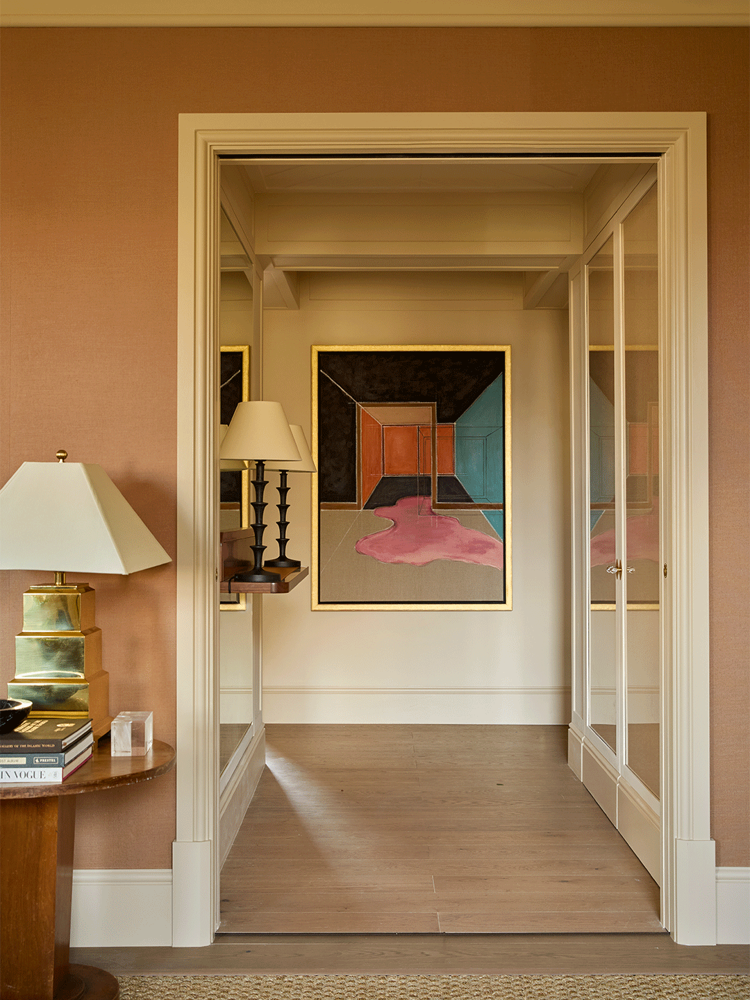
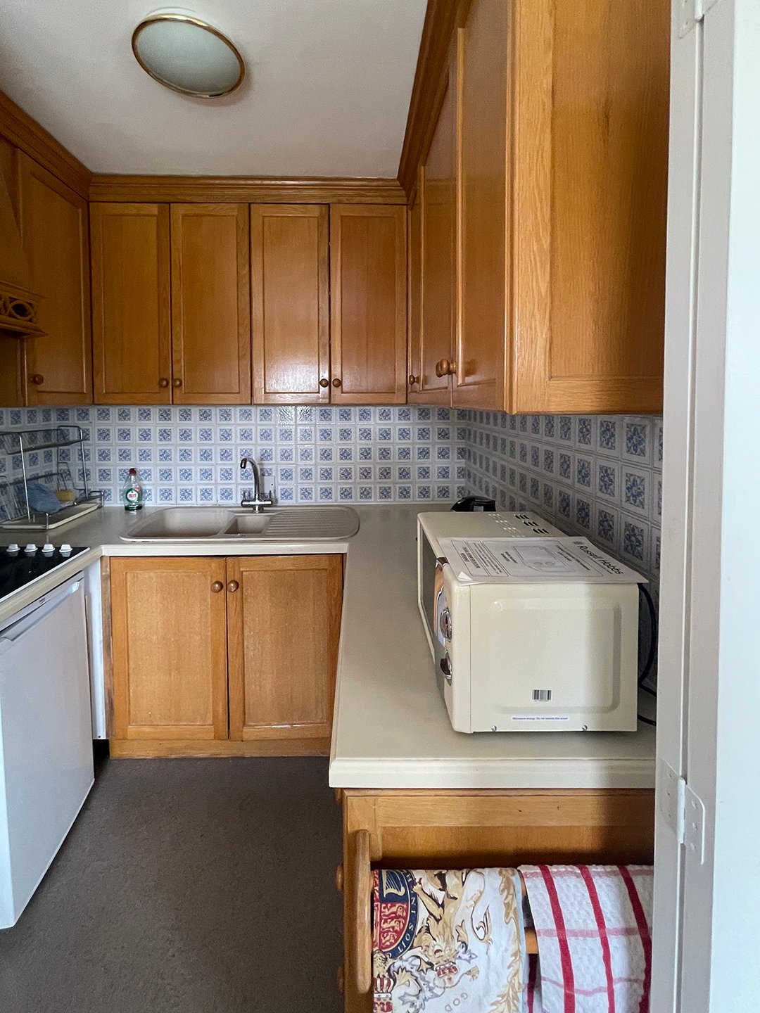
Employing mirrors to bounce natural light around a room and create the optical illusion of expanded space is widely considered a foundational design strategy. However, Sa utilized the technique with exceptional boldness throughout the Notting Hill apartment. A full-mirrored wall was installed in the entry vestibule, instantly opening up and illuminating what was previously the darkest zone of the property. In the compact kitchen, mirrored panels function as a sleek backsplash, amplifying the daylight streaming in from the single window.
Perhaps the most unconventional application of this material occurs in the primary bedroom, where mirrored panels are positioned directly behind the bed’s headboard. When the room’s layered lighting is switched on after dark, the mirrored surface produces an extraordinarily warm, atmospheric glow throughout the sleeping quarters.
The Curves That Conceal
Addressing a chronic shortage of storage was a primary mandate for the renovation. To prevent the single bedroom from feeling constricted by bulky joinery, Sa designed a custom closet featuring softened, curving edges that terminate in open shelving. This thoughtful detailing ensures that anyone walking into the room is greeted by graceful lines and display space rather than the harsh, blunt end of a wardrobe.
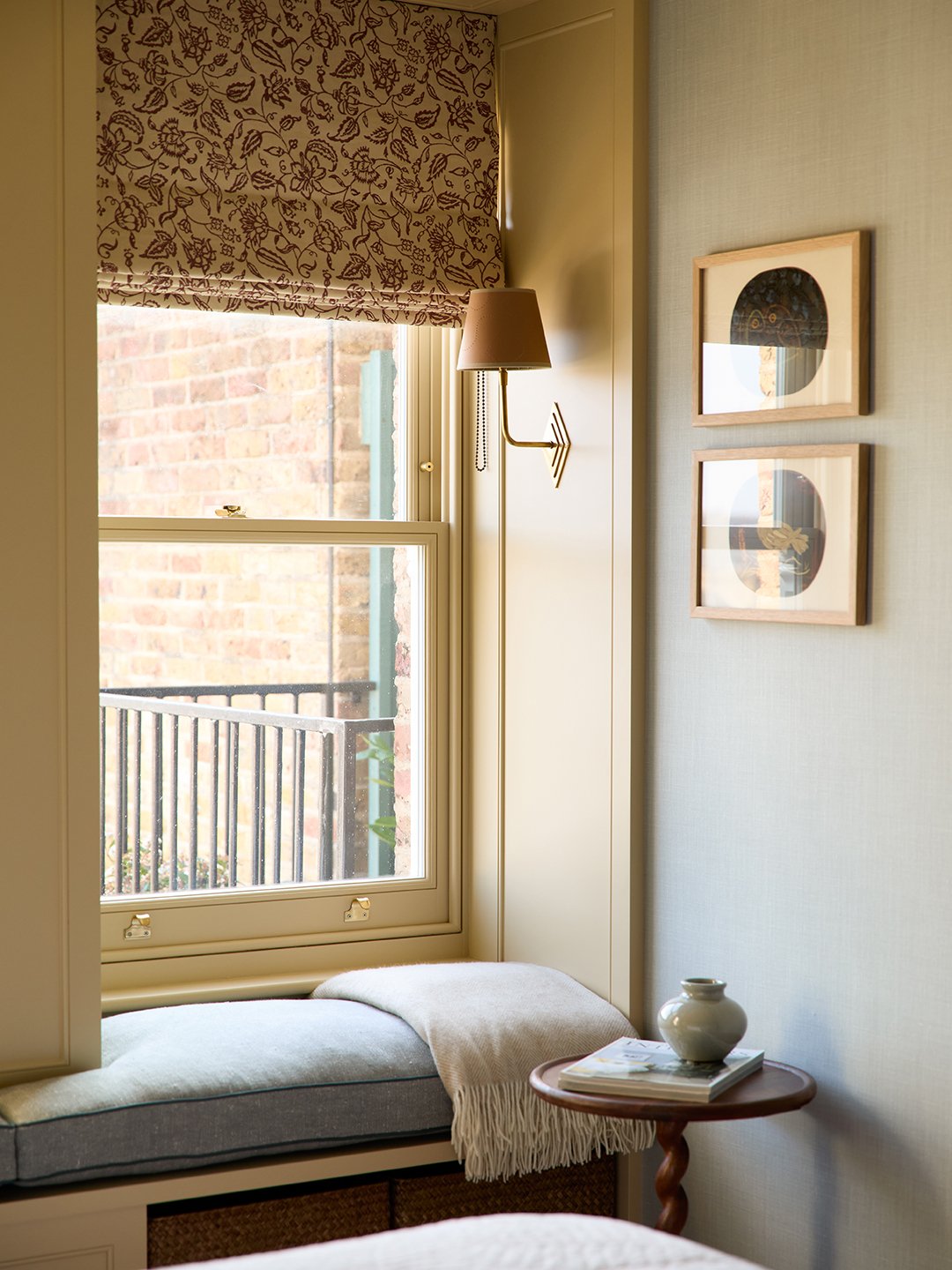
Sa applied a similar philosophy of fluid movement and spatial efficiency to the primary bedroom, where a wardrobe door opens up to reveal a newly built en-suite bathroom. Formerly an awkward storage cupboard containing little more than a sink, the space has been fully transformed into a functional private facility housing a toilet and a shower. A pair of custom window seats completes the transformation, providing the ultimate vantage point for the jet-setting fashion executive to relax, unwind, and gaze out at the historic London rooftops.