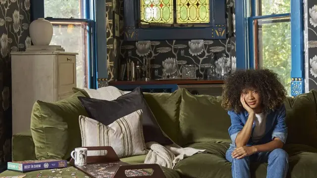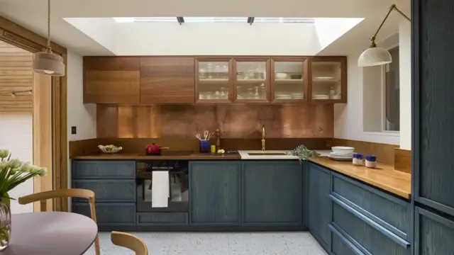
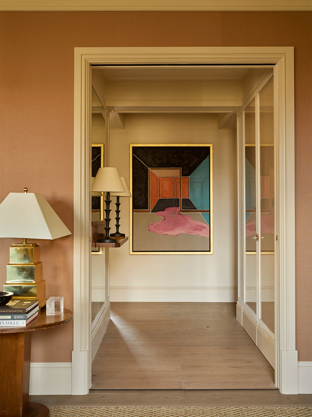
To breathe new life into the 730-square-foot residence, the owner enlisted Claire Sa, co-founder of the renowned London-based interior design studio De Rosee Sa. Charged with crafting the ultimate, high-end pied-a-terre, Sa instinctively knew that the compact footprint should embrace a rich, layered aesthetic rather than leaning into the predictable minimalism of sparing, all-white walls.
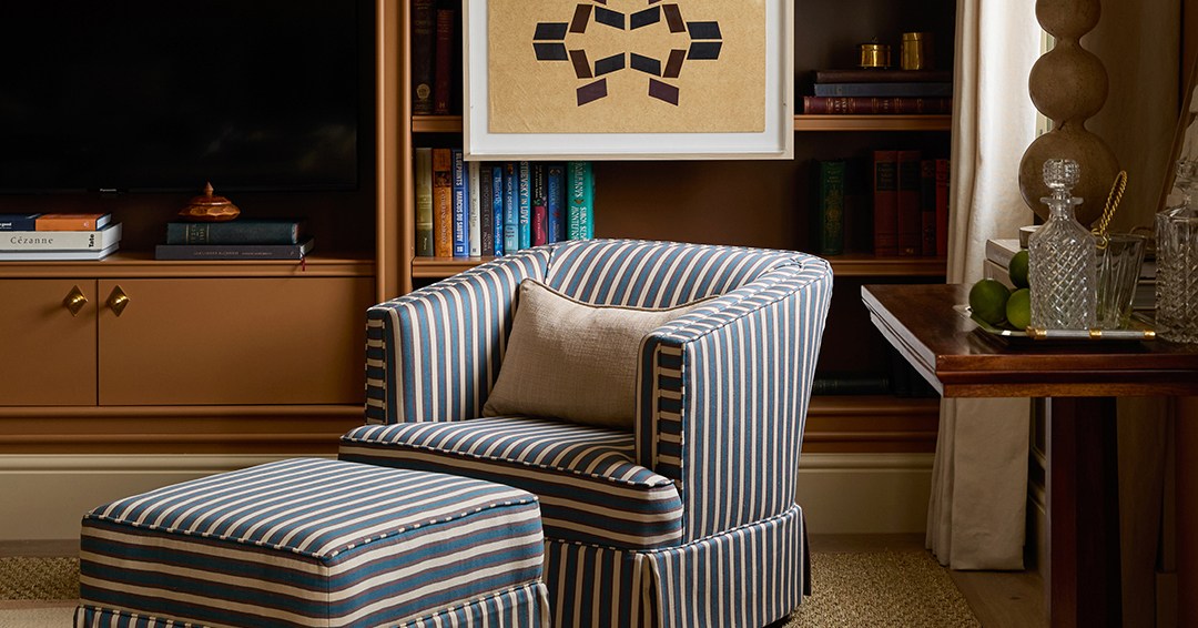
"The key with small spaces, perhaps contrary to what people often think, is to make them feel more intense and filled with books and pictures on the wall," Sa explains, establishing the design philosophy that would guide the entire renovation project.
Sa’s primary objective was to engineer a hotel-worthy level of comfort tailored specifically to the fast-paced lifestyle of the international owner, while simultaneously weaving in deeply personal and sophisticated details. She envisioned a space that looked richly textured and historically layered, yet carefully curated to avoid feeling overly twee or resembling a traditional, Old World English cottage.
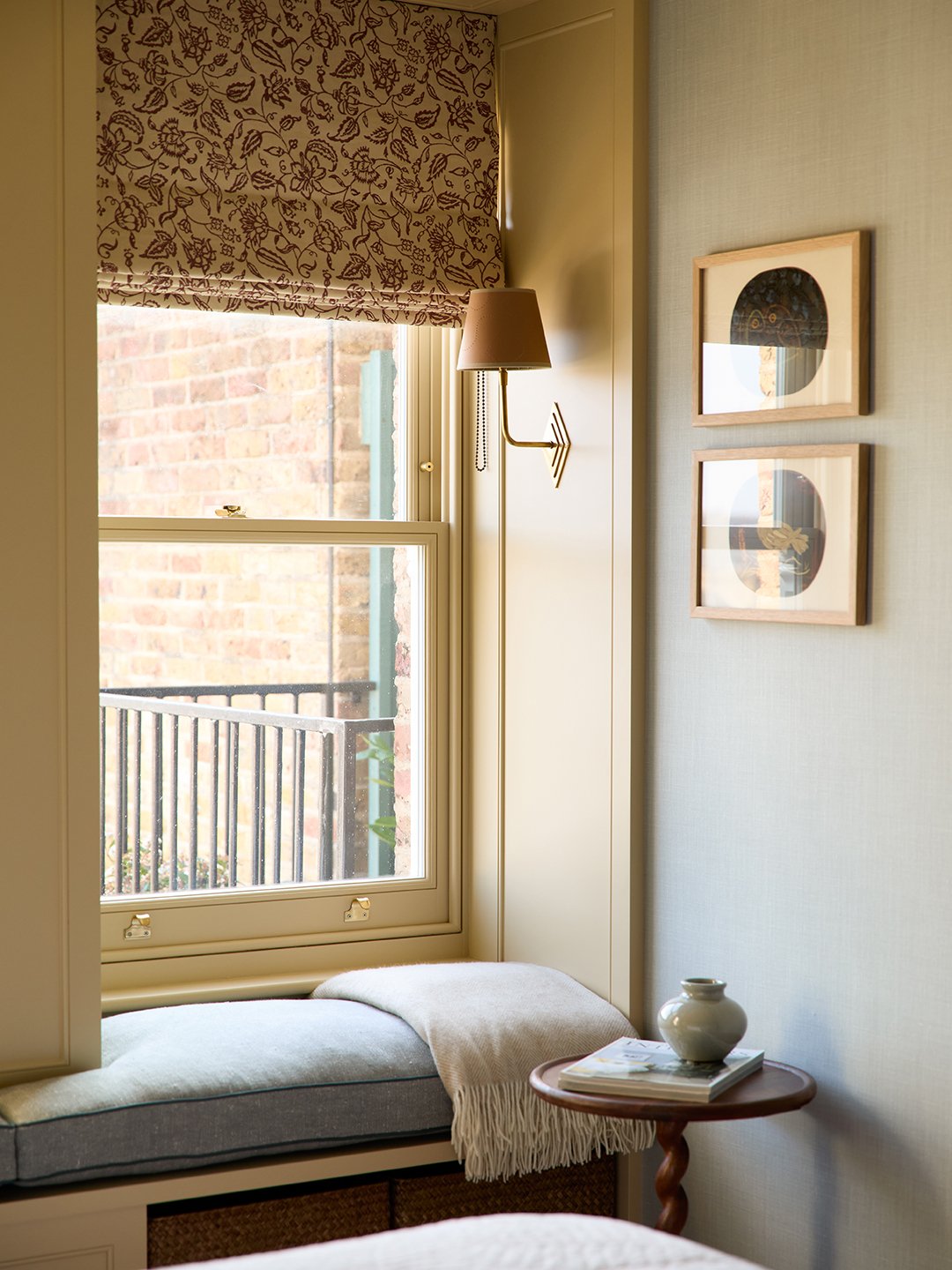
Achieving this delicate design balance hinged on critical tactile choices, such as the luxurious linen wallcoverings implemented in both the living room and the primary bedroom. These premium materials lend a subtle, sophisticated grain effect that standard paint simply cannot replicate. As the transformation unfolded, the petite apartment revealed a masterclass in clever space-planning and interior ingenuity, offering a wealth of design strategies for maximizing style and functionality in tight urban footprints.
The Peekaboo Partition
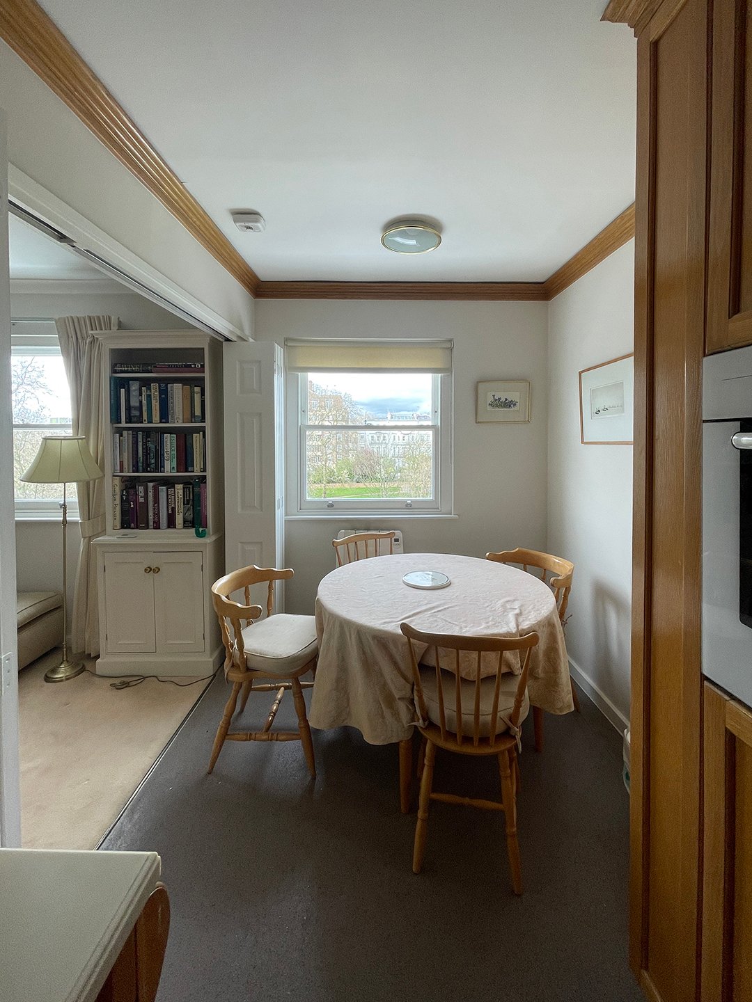
A pivotal architectural move in reconfiguring the apartment’s interior flow involved taking down the solid wall that formerly separated the living room from the kitchen, replacing it instead with a custom-built glazed screen. Rather than opting for a fully open-plan layout—which can often expose clutter and disrupt the visual harmony of a living space—the glass partition cleverly hints at the grander volume of the entire area while preserving a sense of functional separation.
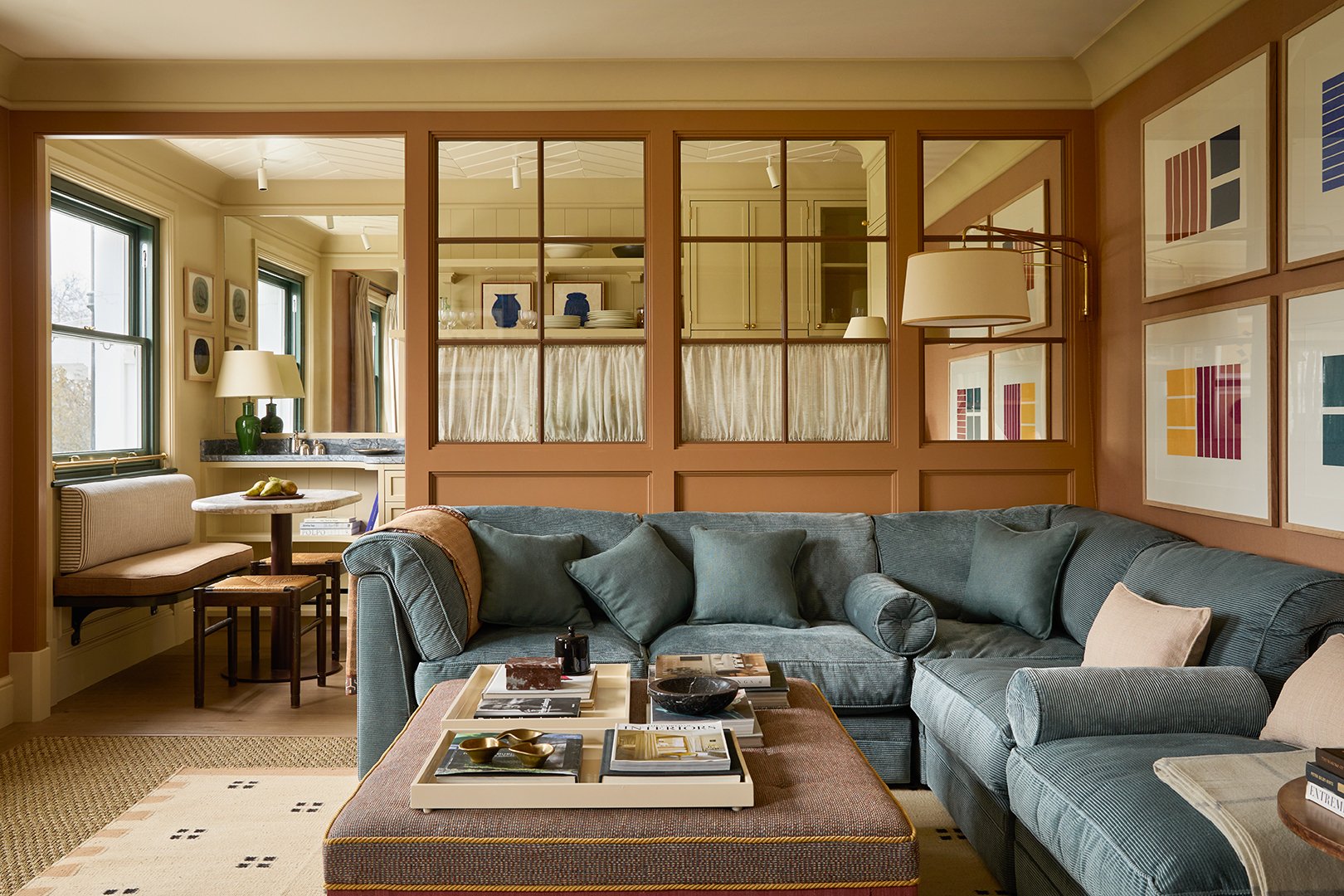
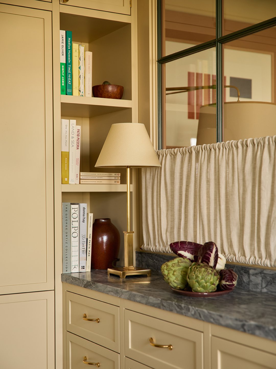
"Rather than go fully open-plan, it hints at the volume of the whole space, and means you can’t see things like pots and pans," Sa notes of the windows, which are partially dressed with charming cafe curtains for added texture and privacy. To anchor the architectural change, a sleek sectional sofa was custom-designed to line up neatly against the new glass partition.
Meanwhile, a less obvious optical illusion hides in plain sight: a panel in the corner that appears to be a decorative mirror is actually a functional facade. "This is something we do quite often because you can hide stuff behind it; in this case, it’s the fridge," Sa explains, illustrating how high-end design can seamlessly marry utility with aesthetic deception.
The Groovy Ceiling
Interior designers often focus entirely on walls and floors, frequently overlooking the vast potential of the fifth wall. "People easily forget about ceilings," Sa remarks. In this Notting Hill project, she transformed an awkward architectural sliver in the kitchen into a dramatic focal point by wrapping it completely in tongue-and-groove paneling. This clever technique introduces rich textural interest overhead, marking the very first time Sa experimented with laying the paneling in a striking chevron pattern.
The Carpet Compromise
Navigating historic or managed apartment buildings in London often comes with strict bureaucratic hurdles. When the apartment building’s management stipulated that wall-to-wall carpeting had to be installed in the living room strictly for acoustic insulation reasons, Sa engineered an elegant workaround that satisfied building regulations without sacrificing her design vision.
Instead of traditional wall-to-wall carpeting, she opted for an oversized, chunky sisal carpet. The expansive material spans nearly the entirety of the room to meet the complex’s strict acoustic requirements, but its neutral, organic texture serves as a versatile base, allowing the designer to layer a softer, more decorative patterned rug directly on top.
The Clever Paintwork
Notting Hill is universally celebrated for its lush, verdant garden squares, and Sa was determined to forge a visual connection between the interior and the vibrant outdoors. To maximize the breathtaking views of the surrounding tree canopies, she made the bold choice to paint the apartment’s window frames a rich, deep bottle green.
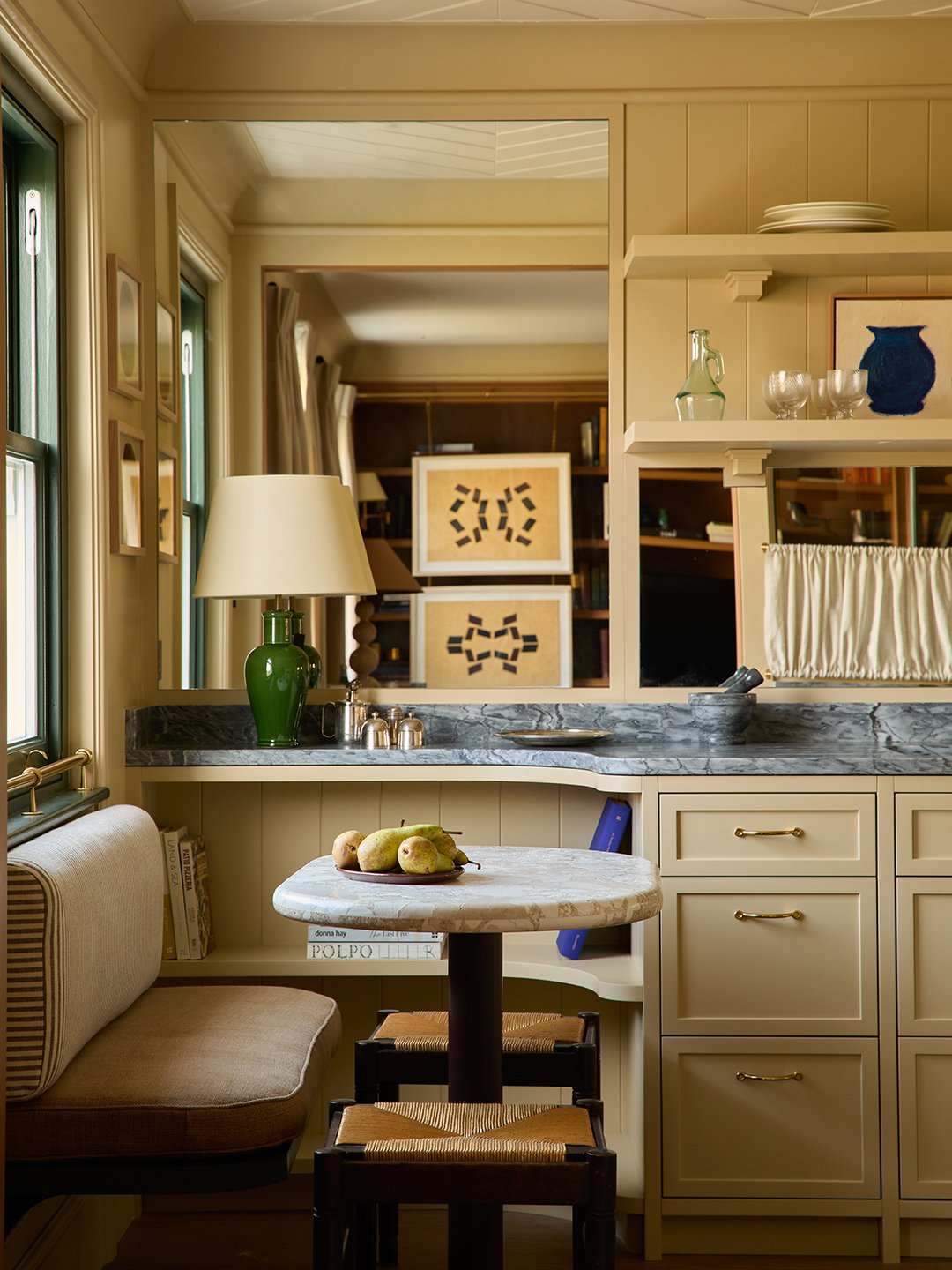
"It’s funny how if you have white windows the outside isn’t pulled in so much. Yet when they are dark, it just pops," she explains.
Another subtle yet remarkably effective detail involved painting the interior backing of the living room’s custom shelving unit a shade slightly darker than the surrounding frame. "Objects and books look better on a darker base," Sa notes. A prime example of this strategy in action is the living room television monitor, which cleverly recedes and almost entirely blends into the dark background when not in use.
The Free-Moving Art
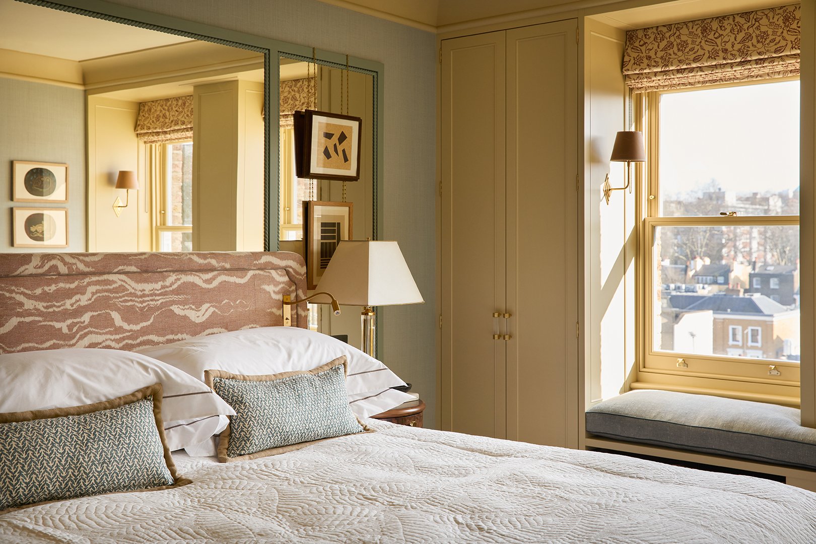
While hanging artwork over established shelving is an increasingly popular interior styling technique, Sa took the concept a step further by installing elegant brass rails directly above the living room shelving units, making the rearrangement of art pieces entirely seamless. "I like mixing artworks up," she says, highlighting the dynamic nature of the home. In the bedroom, framed pieces rest casually against the mirrored walls, adding yet another layer of tactile depth to the unique wall treatments.
The Constant Reflection
Using mirrors to bounce natural light and create the optical illusion of expanded space is one of the oldest tricks in the interior designer’s playbook, a fact Sa readily acknowledges. However, in this 730-square-foot flat, she applied the technique with confidence and restraint.
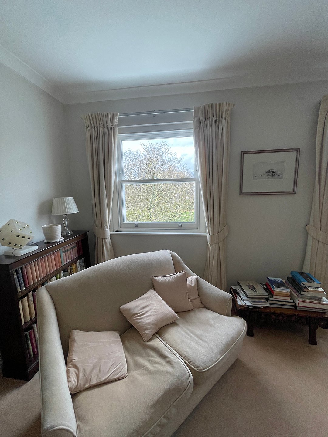
A full mirrored wall in the entryway instantly opens up and illuminates what was previously the darkest part of the apartment. In the kitchen, mirrored surfaces double as a sleek backsplash that actively amplifies the daylight pouring in from the exterior window.
In a more unconventional move, the primary bedroom boasts sophisticated mirrored panels positioned directly behind the bed. "With the lights on at night, it gives such a warm glow," she observes, transforming a potentially stark material into a source of romantic ambiance.
The Curves That Conceal
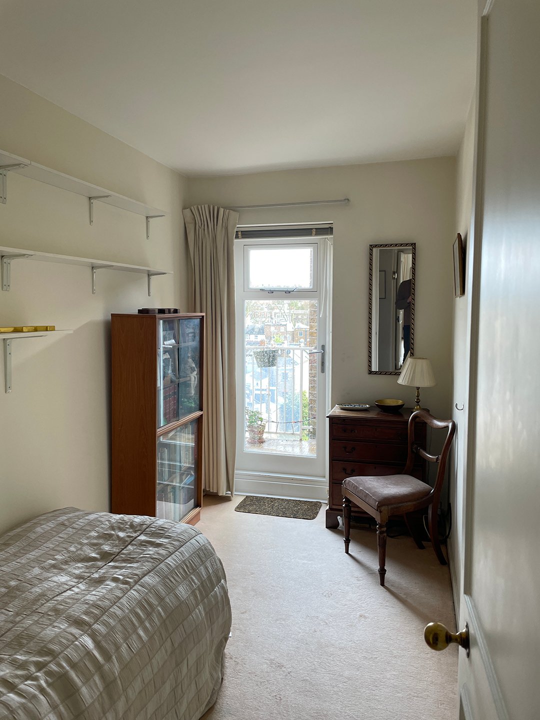
Given its compact footprint, the apartment was desperately crying out for optimized storage solutions without sacrificing precious floor space or creating harsh visual blockages. Sa solved this dilemma by curving the edges of a newly built closet in the single bedroom and finishing the tailored edge with integrated open shelving.
"Means you’re not just looking at the end of a wardrobe when you walk in," Sa explains of the fluid architectural transition.
She applied a similar design logic to the primary bedroom, where a closet door gracefully swings open to reveal a newly constructed en-suite bathroom. Formerly an awkward storage cupboard housing little more than a sink, the space has been expertly reconfigured to accommodate a modern toilet and a functional shower. A pair of custom window seats completes the transformation, offering a quiet, sunlit vantage point to look out over the rooftops and contemplate where Mary Poppins might have floated off to next.