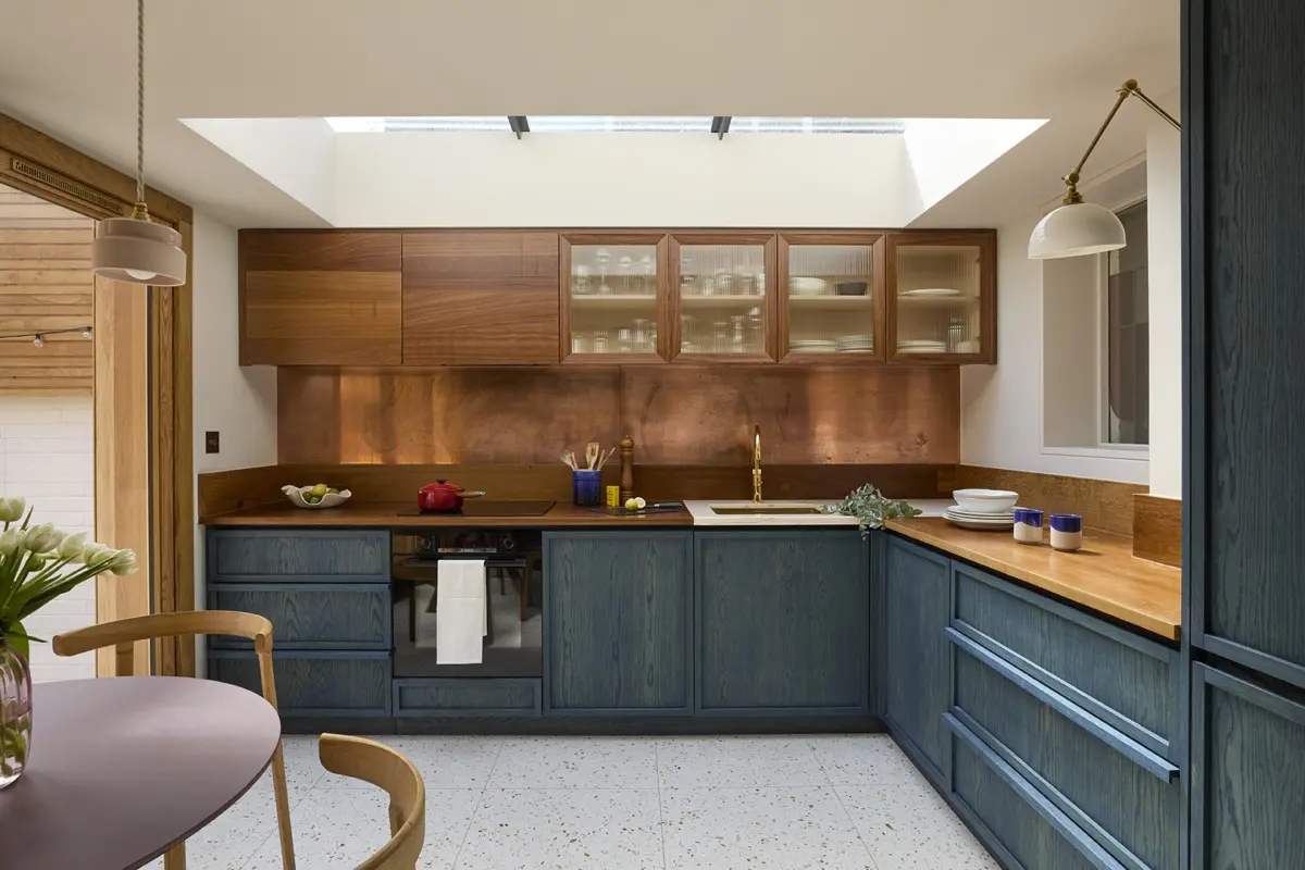
Blue kitchen cabinets are far from a novel concept in contemporary interior design, but Grapsa approached the shade with a fresh perspective. Rather than opting for a flat, opaque finish, she utilized a custom blue stain on the home’s oak cabinetry. This careful application allows the natural wood grain to remain visible, producing rich tonal variations that shift dynamically from bright azure to deep navy under changing light conditions. The kitchen’s abundant daylight—pouring in from a large overhead skylight built into the new extension—creates the ideal environment to support such a saturated, moody palette without making the space feel closed off.
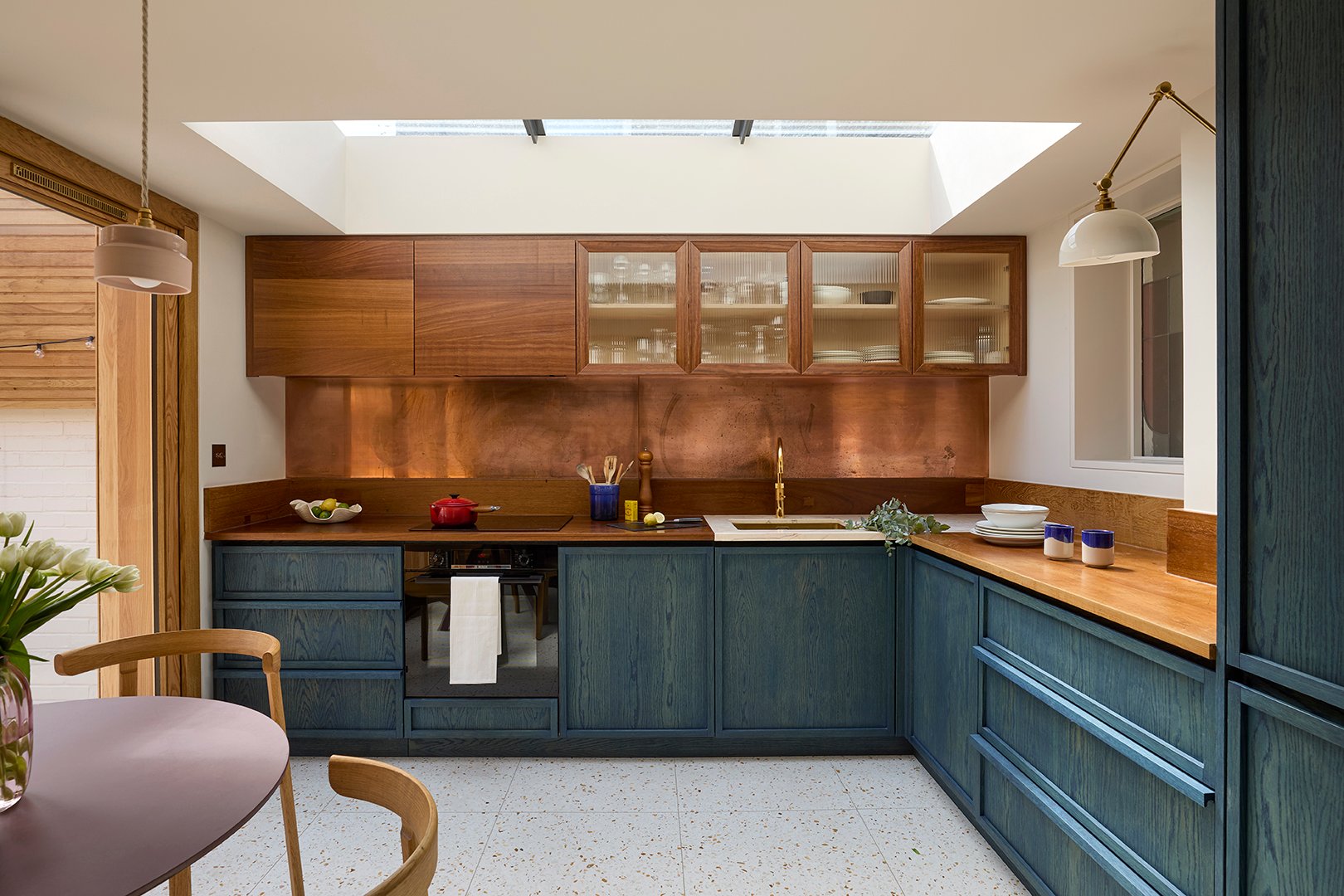
The striking cabinetry is balanced by a warm copper splashback, whose rosy metallic undertones counteract the cooler, heavier qualities of the blue stain. Beneath it all, a textured terrazzo floor anchors the room, while a carefully integrated piece of marble surrounds the sink area, offering a durable and practical surface in a high-traffic wet zone. What truly sets the kitchen apart, however, is its clever use of salvaged materials. Grapsa incorporated reclaimed iroko wood sourced directly from old school science laboratory worktops, giving the timber a completely second life in a residential setting. By mixing these history-laden salvaged surfaces with clean, modern finishes, Grapsa successfully avoided an overly polished or sterile aesthetic, anchoring the home with a unique sense of character.
What were the main priorities for the renovation?
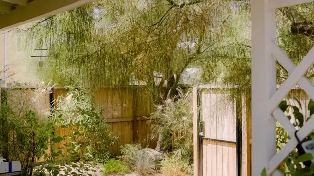
The primary objective of the ambitious year-long project was to rethink the entire ground floor, establishing a more social, cohesive environment that maximized the home’s relationship with its rear patio. Grapsa aimed to craft a sanctuary that felt calm and welcoming—a restorative retreat where the homeowner could recharge after returning from international music industry travels. At the same time, the redesigned layout had to function effortlessly as an entertaining space. By prioritizing spatial connectivity, the architect ensured that the transition between the kitchen, dining area, and outdoor patio feels entirely natural and fluid, while the infusion of warm natural materials and bold colors provides a strong sense of personal identity.
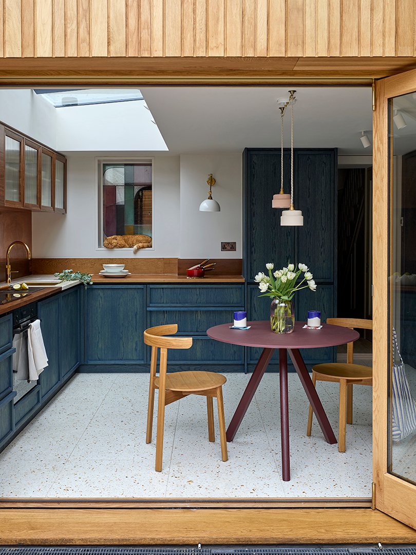
To achieve this level of connection, the structural changes had to be comprehensive. The small, poorly constructed glass extension at the back of the cottage was completely demolished. In its place, Grapsa erected a modern, weather-tight addition that allowed her to push back the rear of the house, expand the footprint of the kitchen, and radically improve the way light and air circulate through the lower level.
Working with salvaged materials and bold palettes
Grapsa’s commitment to historic preservation and material longevity extended beyond the kitchen’s iroko laboratory countertops. Rather than ripping out and replacing the home’s original pine flooring, she chose to repair and meticulously refinish the existing boards, letting their imperfections tell a story. Her philosophy centers on blending the old with the new to prevent interiors from feeling too uniform or manufactured.
This philosophy extends directly to her approach to color, which relies heavily on context and lighting. When advising clients on how to approach similarly bold palettes, Grapsa emphasizes the importance of evaluating a color within its complete spatial composition rather than viewing it in isolation. Factors such as surrounding materials, natural light levels, existing furniture, rugs, and artwork must all be accounted for. Testing physical samples in the actual room is non-negotiable, as environmental light can dramatically alter how a shade reads on a wall, ceiling, or cabinet front.
This careful consideration of light and perspective is perhaps best demonstrated in the home’s study-slash-guest bedroom. Instead of saturating the walls with a heavy hue—which might compromise the bright, airy feel the client desired—Grapsa employed a reverse color scheme. She painted the ceiling, trim, doors, and skirting boards in Rouge II by Paint & Paper Library. By framing the room with this vibrant, warm red overhead and along the architectural borders, she introduced significant depth and character while keeping the walls neutral and versatile, allowing the room to easily transition between a functional home office and a comfortable guest suite.

Playful surprises and hidden architectural details
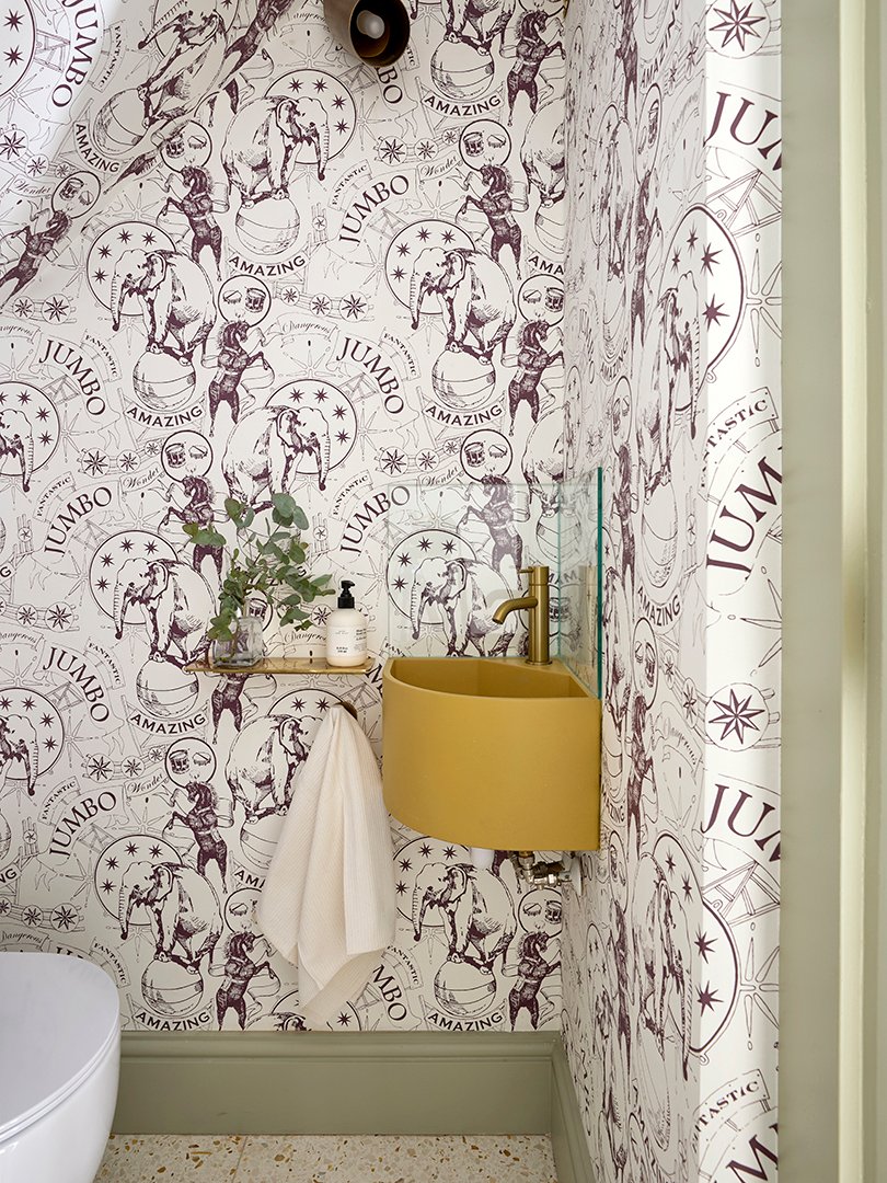
Throughout the rest of the London dwelling, Grapsa continued to incorporate unexpected moments of visual delight. In the compact powder room—tucked discreetly beneath the stairs and cleverly concealed within the surrounding joinery—she utilized Jumbo wallpaper by British designer Daniel Heath. Inspired by the theatricality and spectacle of Victorian-era circuses, the whimsical, narrative-driven pattern transforms a small, utilitarian space into an immersive design experience without imposing its intense personality onto the rest of the house.
Another defining feature of the ground-floor reconfiguration is the custom etched-glass window positioned between the kitchen and the dining area. Originally a standard doorway that was bricked up and infilled during the floorplan redesign, Grapsa sought a way to maintain a subtle visual link between the front of the home and the rear patio while still capturing filtered natural light. The bespoke window features a geometric composition of curved and straight lines rendered in a palette of colors pulled from the rest of the house. By day, it offers privacy without obstruction; by evening, the colored glass projects a soft, textured glow into both adjoining rooms.
These thoughtful spatial gestures culminate in details that might easily be overlooked by a casual visitor, such as the ginger cat that has permanently claimed the sill of the internal etched-glass window as its favorite lookout point. Paired with other bespoke elements, like the custom sideboard in the dining room and a bathroom featuring a striking yellow tub resting on a multicolored marble mosaic floor of yellows, warm browns, and beiges, Grapsa’s intervention has turned a dated, disconnected property into a deeply personal, texturally rich London home.