For the husband-and-wife design duo, the space represented the ultimate test of their creative problem-solving abilities. It was the room they felt an immediate connection to and the one they believed needed their intervention the most. Recognizing their enthusiasm, the Brooklyn Heights Association soon handed them the adjoining dining room as well, effectively transforming what was originally intended as a targeted kitchen project into a comprehensive redesign of the entire back parlor floor.
There was, however, a significant complication that separated this assignment from a typical high-end interior design showcase. The homeowner had only recently completed her own personal renovation of the property and retained strict approval rights over any permanent structural or cosmetic alterations. Consequently, the designers were barred from simply executing a clean-slate gut renovation. Instead, they faced a compressed 15-day window to pitch and secure approval for ambitious adjustments—including new walls, structural beams, and significant kitchen modifications—before launching into an intensive 25-day construction timeline.
Rather than viewing these stringent limitations as a roadblock, the designers embraced the constraints as the catalyst for the project’s creative direction. By relying on a strategic combination of clever camouflage, surface layering, and precise editing around elements that had to remain in place, Sugarhouse managed to weave a narrative of history and attitude so seamless that it becomes virtually impossible to distinguish where the original 19th-century architecture ends and the modern design interventions begin.
When You Can’t Fix the Ceiling, Reframe It
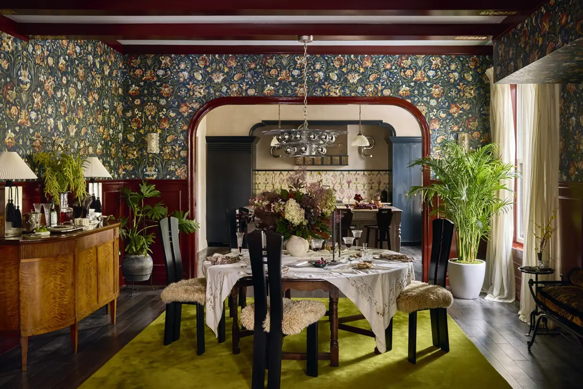
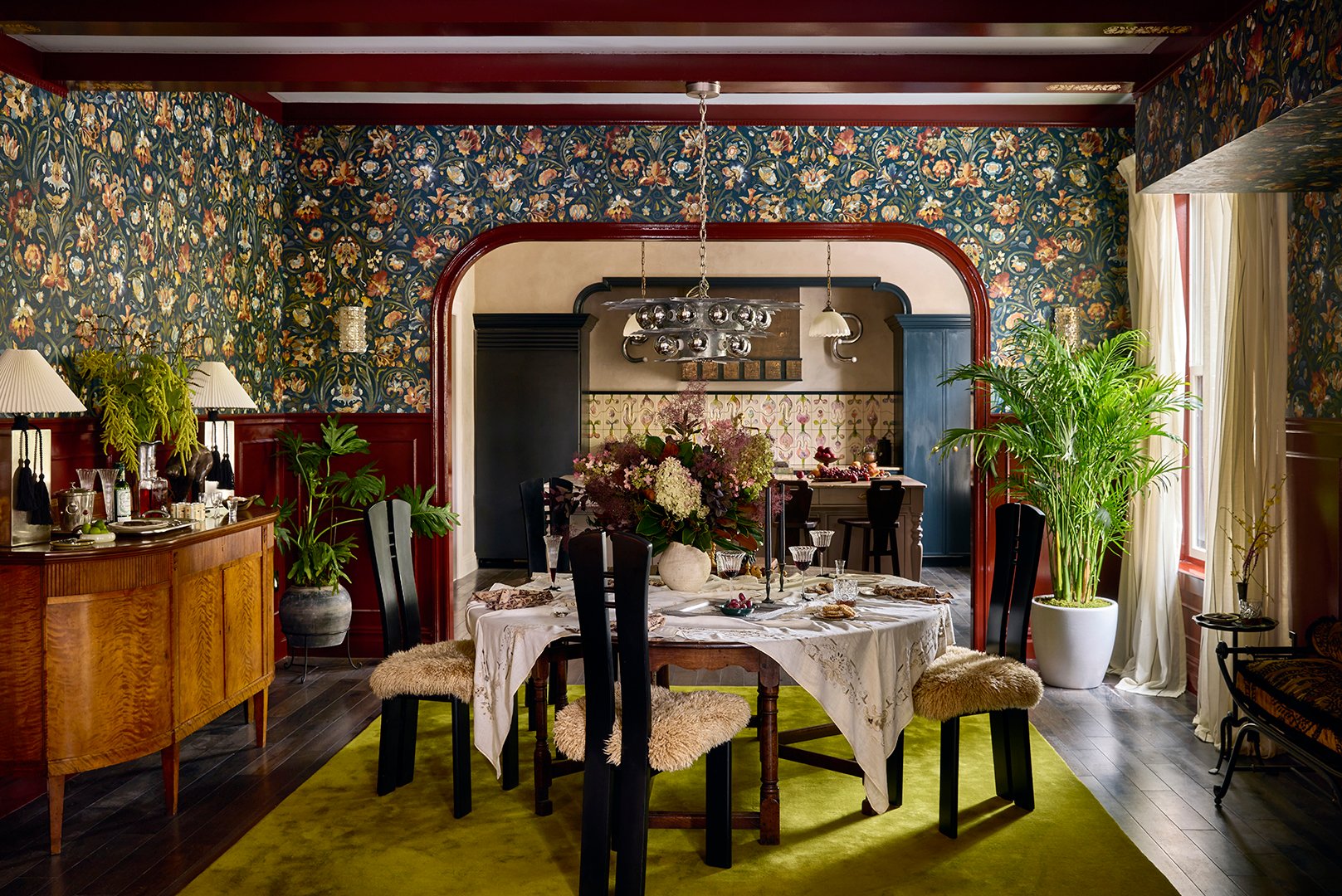
Upon entering the space, the design team encountered a distinct architectural challenge in the dining room, where a combination of structural soffits meant to conceal vital mechanical systems had resulted in three disparate ceiling heights. Rather than attempting a disruptive and costly structural overhaul to unify the planes, Sugarhouse chose the path of visual camouflage.
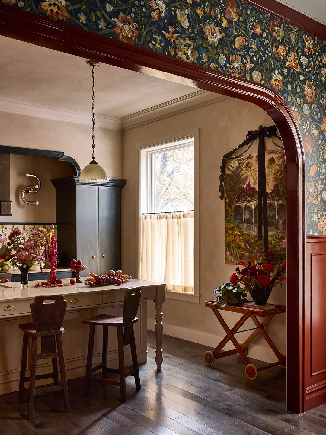
They deployed a large-scale, dramatic wallpaper from House of Hackney that continuously engages the eye, allowing the awkward ceiling transitions to gracefully fade into the background. To further unify the overhead expanse, the designers installed faux beams that spanned the differing heights, successfully integrating the intrusive soffit into the home’s historic architectural language.
Because the pre-existing ceiling height was already relatively low, the team opted to keep the newly installed wainscoting deliberately short to maintain a balanced vertical proportion. To amplify the natural light and prevent the moody color palette from making the space feel cave-like, they bypassed a traditional matte paint finish. Instead, they selected a high-gloss finish utilizing Farrow & Ball’s Deep Reddish Brown, a choice that bounces ambient light around the room and introduces a sophisticated sheen.
Give a Pass-Through Room a Stronger Perimeter
Before the cosmetic layers of wallpaper and high-gloss paint could achieve their desired effect, the designers first had to solve a fundamental layout issue: making the dining room function as a distinct room rather than a mere thoroughfare. Because the space sat directly on the primary traffic route leading to the kitchen and the central staircase, it previously lacked any meaningful spatial definition or architectural boundary.
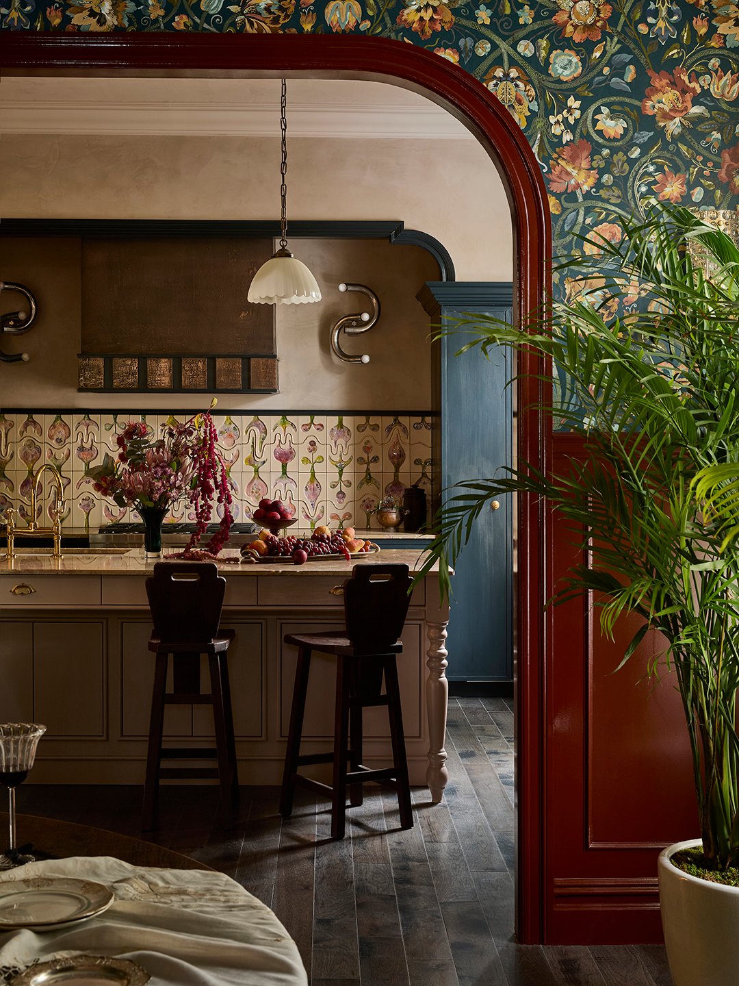
To remedy this, the designers constructed a partial wall featuring a broad, elegant arched opening. This architectural intervention successfully delineated the dining room without completely severing its visual connection to the kitchen. Furthermore, the new partition provided a logical stopping point for the wallpaper and wainscoting while offering necessary vertical wall space for furniture placement—crucial steps in achieving the overarching design goal of making the updates look as though they had been part of the house for over a century.
Don’t Gut What You Can Rework
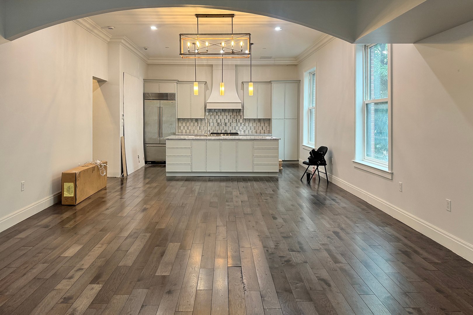
The kitchen was adequately equipped with storage cabinetry, but its layout suffered from a total lack of socializing space, particularly around the central island. Maximizing closed cabinetry had inadvertently prevented people from congregating naturally in the heart of the room.
Rather than completely re-planning the footprint, Sugarhouse focused their efforts on strategic in-place editing. Their millworker wrapped the base of the existing island in fresh wood, integrated new legs and a replacement countertop, and opened up one side to accommodate comfortable bar seating. These targeted adjustments instantly transformed a rigid, utilitarian block into a welcoming social hub without altering the original footprint.
To streamline the visually cluttered back wall, the team replaced the existing pantry doors with cleaner, simplified fronts and removed the upper cabinets entirely to carve out an arched range alcove. They carried this streamlined approach over to the refrigerator. Because a panel-ready appliance swap was logistically impractical within the tight schedule, the designers covered the standard stainless steel front with a color-matched, custom-printed vinyl wrap, playfully describing the clever cover-up as a giant sticker.
Let the Statement Stone Set the Palette
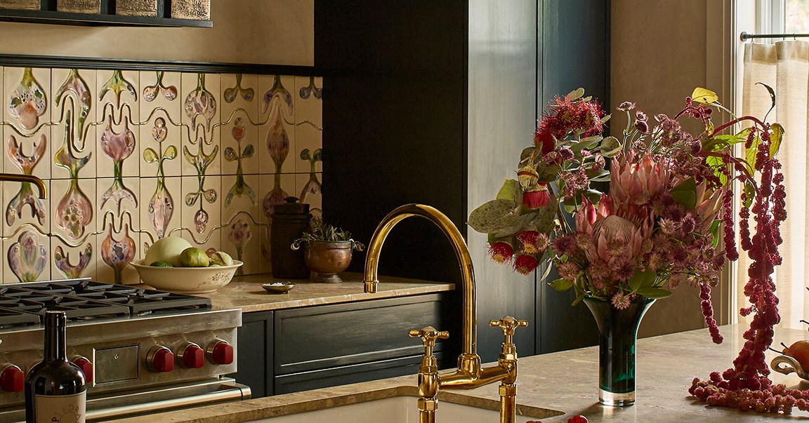
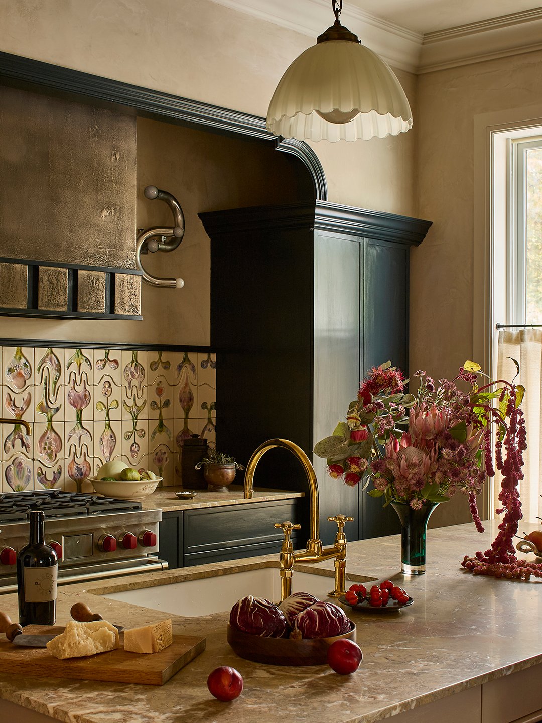
The kitchen’s original countertops consisted of a relatively nondescript gray marble that failed to anchor the space. Sugarhouse replaced them with Melange, a much warmer and more visually animated stone sourced from Artistic Tile. The rich interplay of pinks, creams, and muddy greens within the marble provided a vibrant anchor for a sophisticated color scheme involving cabinetry painted in Farrow & Ball’s Black Blue, an island finished in Dead Salmon, and walls coated in JH Wall Paints lime plaster.
Rather than opting for a neutral, subdued backsplash that might disappear into the background, the designers commissioned Riwal Manufaktura to produce a dramatic, dimensional botanical tile. The bold choice was essential to match the inherent theatricality and strong personality of the new stone surfaces.
Keep the Hood, Change the Finish
Rather than replacing the existing range hood, the design team chose to completely reinvent its appearance in place. Sugarhouse boxed in the original structure and applied Midas Metall—a specialized powdered-metal coating that is applied wet, then meticulously sanded and polished until it achieves the authentic look and feel of solid metal. The inclusion of small squares along the lower edge reinforced the illusion, elevating the hood from a standard appliance insert into a custom architectural focal point.
The Floors Might Not Be the Problem
While the design firm initially harbored intentions of replacing the worn wood flooring throughout the floor, the homeowner ultimately rejected the idea. In retrospect, that resistance proved to be a design blessing. Once the dining room was anchored by a chartreuse-green rug from Nordic Knots, paired with richer wall hues and layered, warmer lighting, the existing wood floors took on an entirely new character.
Shifting the lighting strategy did much of the heavy lifting. The designers disconnected the harsh, cool recessed fixtures and pivoted entirely to lower-set wall sconces and vintage pendants, which softened the overall atmosphere and introduced a warm glow to the wood underfoot.
Rather than striving for uniform hardware, the kitchen proudly showcases multiple metal personalities, including unlacquered brass plumbing fixtures from Waterworks, aged vintage lighting, and the dark metal finish on the range hood. Eschewing the common client anxiety that every metal finish must precisely match, the designers embraced a philosophy centered on materials that naturally develop a rich patina over time. The unlacquered brass will naturally darken, the vintage fixtures already display their history, and the textured hood is designed to age gracefully alongside the home.
The dining room reflects this same intentional philosophy through its furnishings, where a childhood table belonging to Jonathan sits alongside sculptural 1970s chairs upholstered in extra-long Mongolian shearling, a burl wood credenza, and lighting fixtures drawn from yet another era. By allowing the elements to tell a story of accumulated history rather than a single, assembled decade, the updated spaces successfully bridge the gap between historic preservation and contemporary living.