Once he had zeroed in on this specific concept, Warner knew he needed to collaborate with a design team that understood residential intimacy. He turned to Brooklyn-based Elizabeth Roberts Architects (ERA), a studio widely celebrated for its thoughtful, context-driven residential architecture and interior design. In addition to bringing the dated hotel interiors firmly into the present day, Warner hoped the studio could cultivate the genuine feeling of a private guest house. He wanted the environment to feel collected over time rather than heavily designed, prioritizing warmth and comfort over ostentatious luxury. Furthermore, Warner sought to execute the renovation in an environmentally conscious and economically pragmatic manner.
The core directive given to Elizabeth Roberts Architects was remarkably targeted: reimagine the property entirely through interior design interventions rather than moving walls or altering the building’s structural footprint. Working closely with Elizabeth Roberts and Robby Rathmann-Noonan, the firm’s director of interior design, the hotel was given a complete lease on life while leaving its architectural bones largely untouched. A strategic application of fresh paint, tactile wallcoverings, updated tilework, carefully curated furnishings, and clever built-in elements allowed the team to transform the dowdy, tired mountain stay into a remarkably chic and cohesive retreat. Because the designers relied so heavily on accessible, residential-scale tactics, the property ultimately yielded a wealth of sophisticated interior design ideas rooted in smart material choices and textural layering.
Make a Moody First Impression
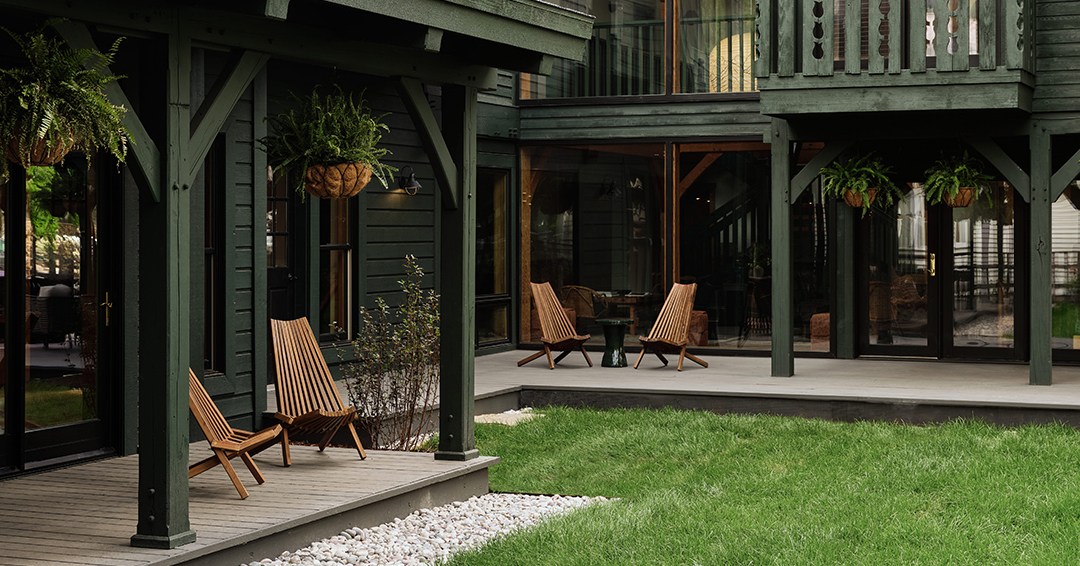
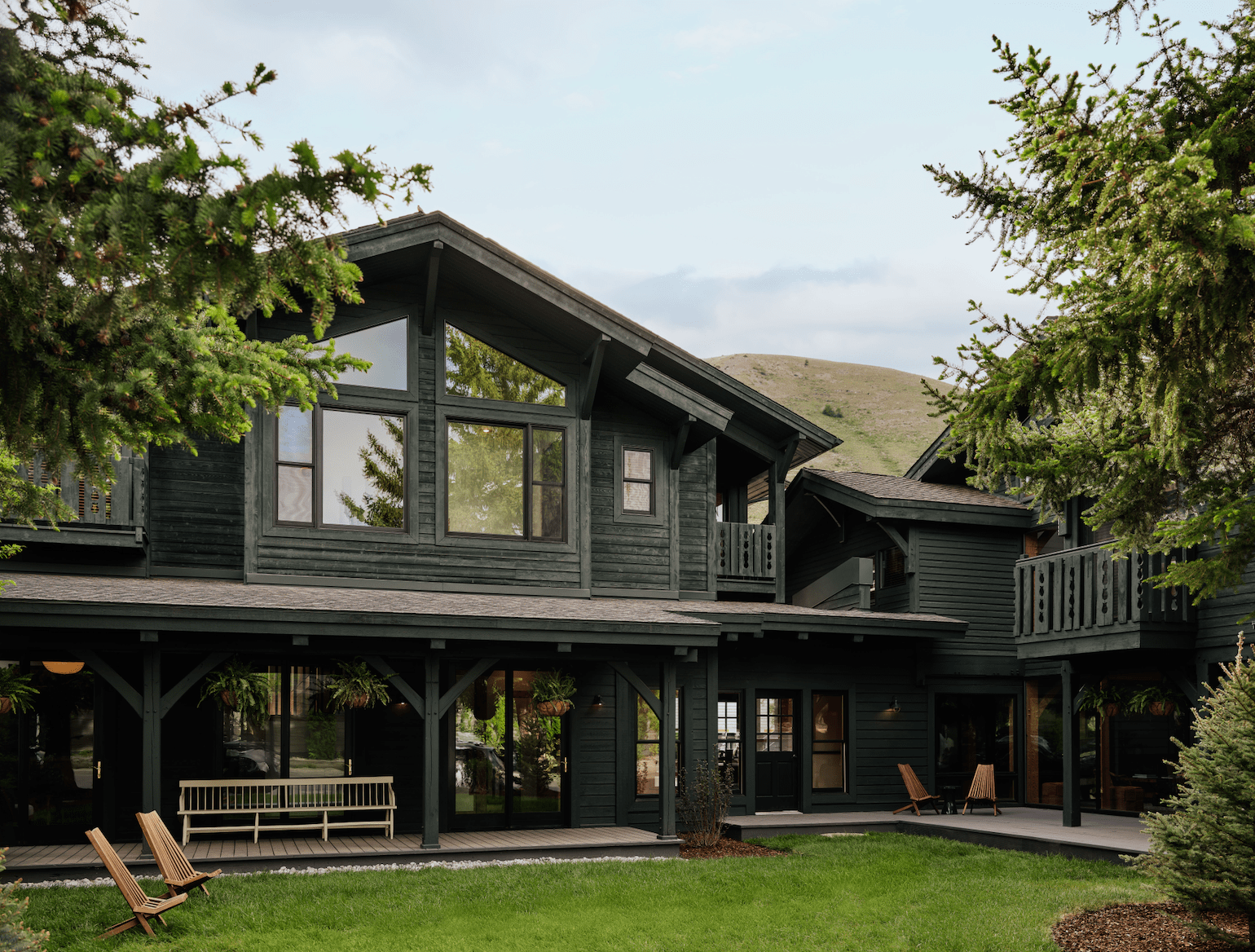
The transformation of the Alpine House begins long before a guest steps foot through the front door. The exterior of the hotel immediately projects a fresh, contemporary aesthetic largely due to a deliberate color-drenching technique applied to all the exterior wood surfaces. Roberts opted for a custom-mixed exterior stain from Sherwin-Williams’s Woodscapes line, combining a deep forest green with 75 percent black pigment. The result is a heavy, light-absorbing finish that feels deeply connected to the surrounding natural landscape of Jackson Hole.
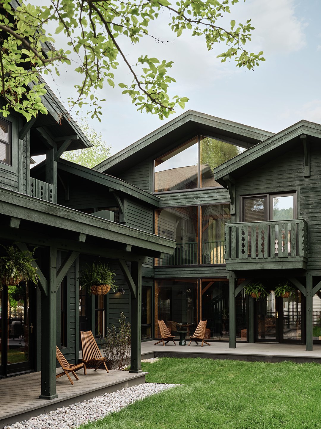
Roberts notes that the finish is exceptionally matte, completely eschewing any shiny or reflective sheen that might feel out of place in an alpine environment. This bold exterior treatment successfully unifies disparate architectural elements and demonstrates how a thoughtful, saturated paint job can completely revitalize a weather-beaten structure that has seen better days, establishing a moody and sophisticated tone for the entire property.
Anchor Each Room With More Than Paint
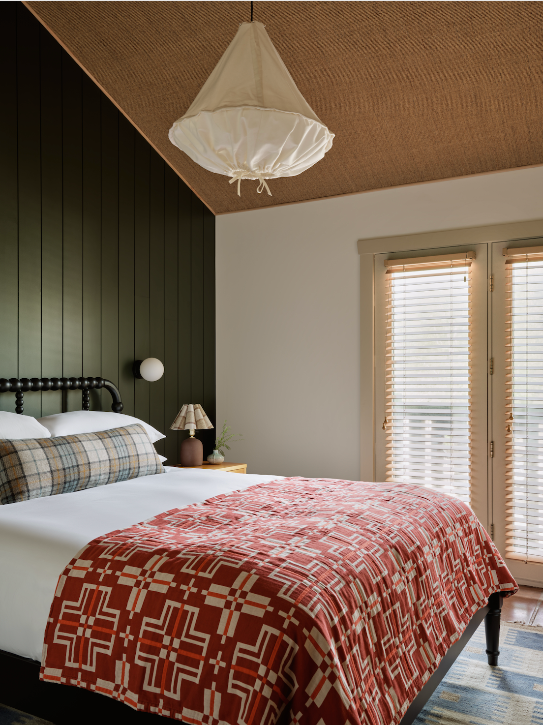
Inside the guest quarters, the design team sought ways to add architectural presence without undertaking costly construction. Roberts and Rathmann-Noonan conceived of a shiplap headboard wall for every guest room, painted in a deep, organic green using Sherwin Williams’s Laurel Woods shade. This deliberate application serves a functional design purpose beyond mere decoration.
According to Rathmann-Noonan, the strong vertical lines of the shiplap draw the eye upward, creating a distinct sense of vertical height and establishing a strong focal point that simple paint alone could never achieve. By utilizing textured wall treatments like shiplap, the designers added a layer of craftsmanship and visual substance that elevates the modest rooms, proving to be an effective strategy for adding character to spaces with standard ceiling heights.
Soften the Ceiling
Continuing their exploration of surface-level transformations, the architects employed another unexpected technique to alter the atmosphere of the guest rooms without adjusting the underlying architecture. They chose to line the ceilings with a natural sisal wallcovering, introducing a dense layer of organic texture overhead.
Roberts points out that papering ceilings with natural fibers is an exceptionally effective way to personalize individual rooms, infusing them with warmth and a finished, tactile quality. Crucially, this design choice accomplishes this visual warmth without consuming any precious floor space that might otherwise be required for bulky decorative elements. The overhead texture creates an intimate, cocoon-like atmosphere, offering a compelling solution for rooms that lack architectural detail.
Make Organization Design-Worthy
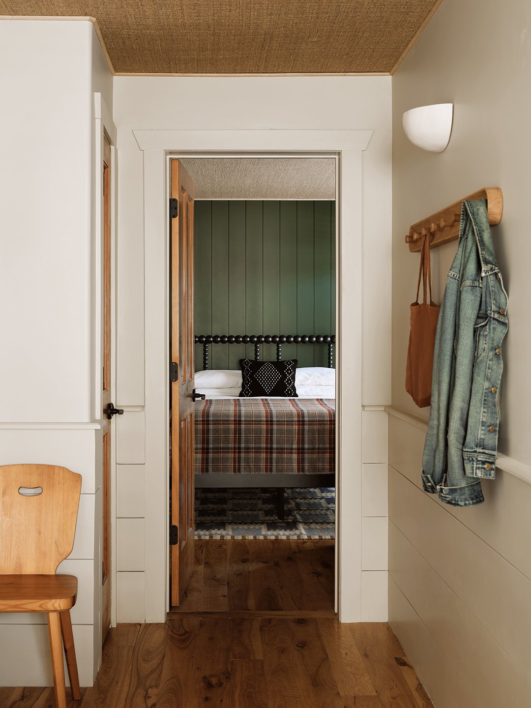
In spaces designed for travelers, practical storage is an absolute necessity, particularly given the relatively compact footprint of the guest rooms at the Alpine House. To address this functional requirement without resorting to generic hotel furniture, Elizabeth Roberts Architects opted for a modern interpretation of a classic Shaker peg rail.
Running neatly along the walls of each room, the continuous wooden pegs provide guests with an intuitive, accessible place to hang coats, hats, and personal belongings. Anyone who has spent time in a hotel room devoid of adequate hooks understands their sheer utility. By executing the peg rail with clean, modern proportions and high-quality materials, the designers transformed a basic organizational tool into an intentional, design-worthy architectural feature.
Weave in Ebony Accents
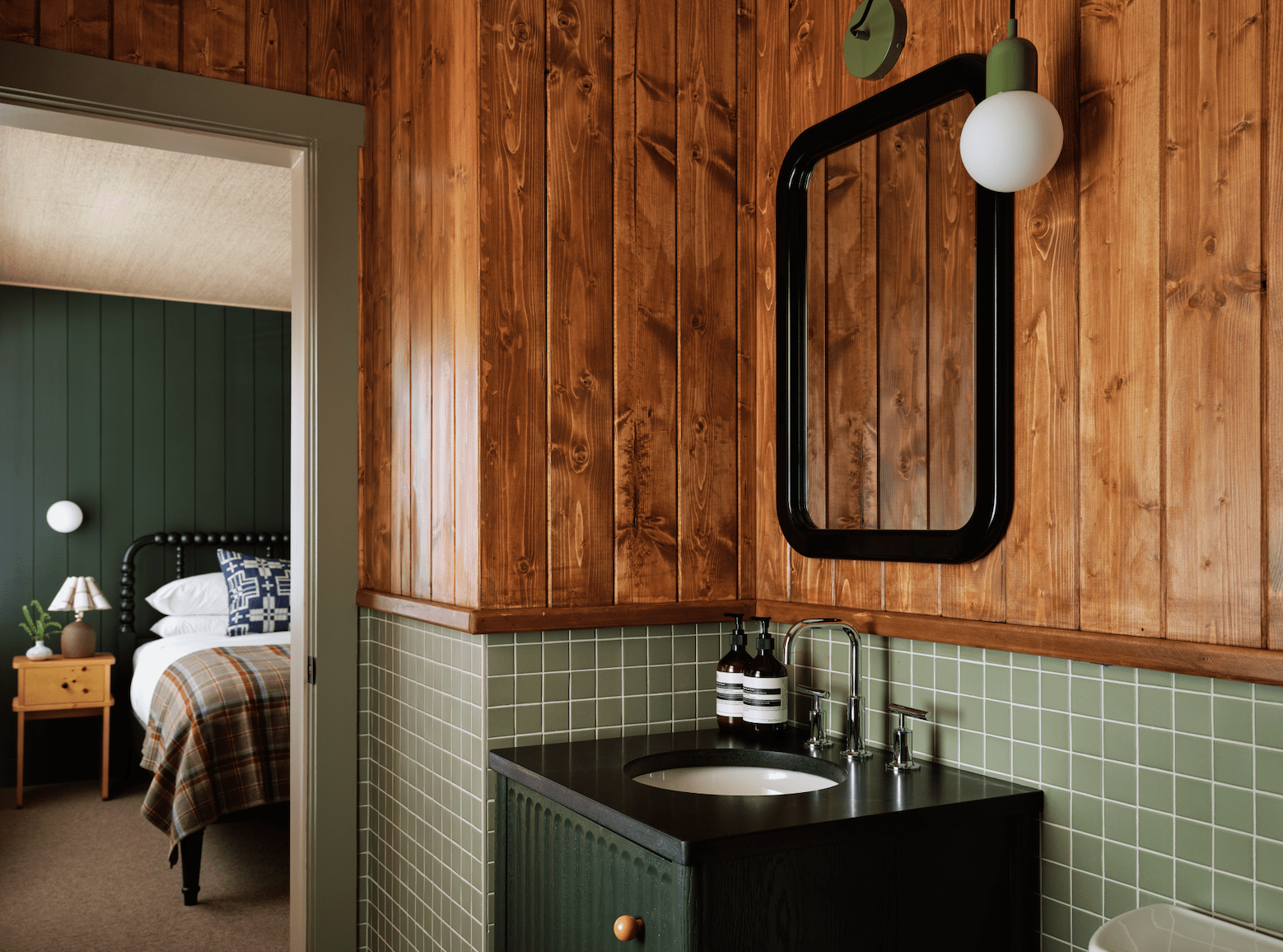
A closer examination of the interiors reveals a subtle yet consistent visual thread running through every space on the property: a deliberate dash of black. Whether expressed through hardware, light fixtures, or small decorative objects, these dark accents provide a sharp, grounding counterpoint to the warm wood tones and saturated green walls.
Roberts emphasizes that the studio loves accenting with black because it introduces a crisp, modern edge that cuts through heavy, traditional color palettes. Rathmann-Noonan echoes this sentiment, noting that these dark punctuation marks help bridge the gap between historic alpine aesthetics and contemporary design sensibilities. This intentional use of black serves as a visual anchor, tying together disparate rooms and giving the entire hotel a cohesive, thoughtfully edited feel.
Double-Up on Bedside Lighting
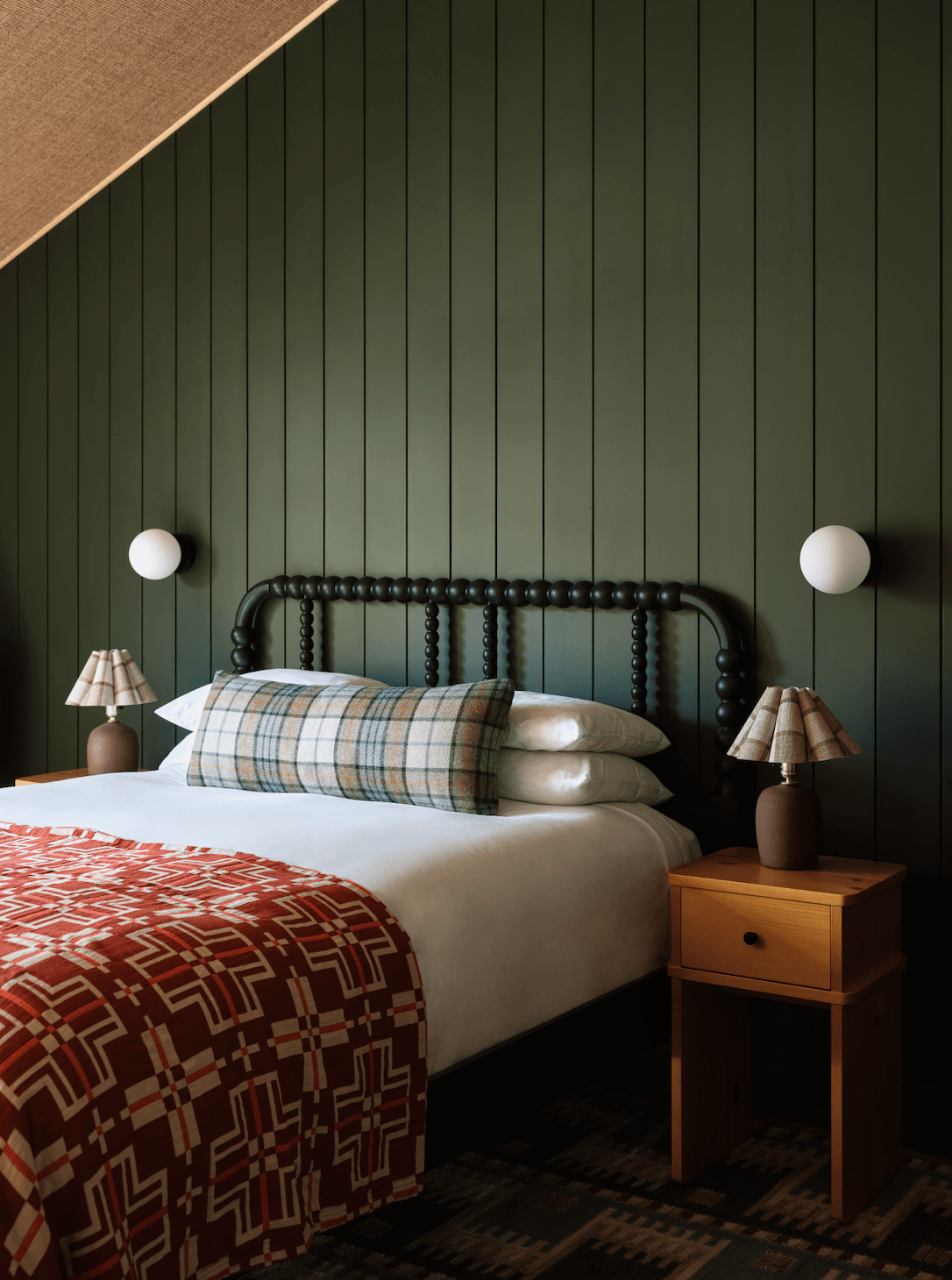
To enhance the visual interest along the bed walls while simultaneously improving functionality, the design team departed from standard hotel lighting conventions. Instead of relying on a single light source by the bed, ERA incorporated a dual-layered lighting scheme featuring wall-mounted sconces from Pin Lighting alongside ceramic table lamps from Earth and Element.
From a practical standpoint, Roberts explains that offering multiple light sources gives guests greater control over both the intensity and the quality of light in their rooms, accommodating everything from reading to winding down for sleep. This layered approach adds depth and dimensionality to the bedside vignette, demonstrating how thoughtful lighting choices can elevate a bedroom’s overall ambiance.
Use Iconic Patterns Strategically
Incorporating traditional motifs into a mountain hotel project carries inherent risks, particularly with patterns like tartan or plaid that run the risk of sliding into heavy-handed cliché. Initially, Roberts was hesitant to include plaid in the Alpine House redesign for precisely this reason.
However, the design team managed to successfully integrate the iconic pattern by exercising strict restraint. By using plaid very sparingly and anchoring it within a carefully curated, muted color palette, they avoided overwhelming the spaces. This strategic approach ensures that the pattern feels fresh and purposeful rather than tired or overly thematic, proving that even the most recognizable traditional textiles can find a place in contemporary design when handled with care.
Mix Up Your Furniture Sources
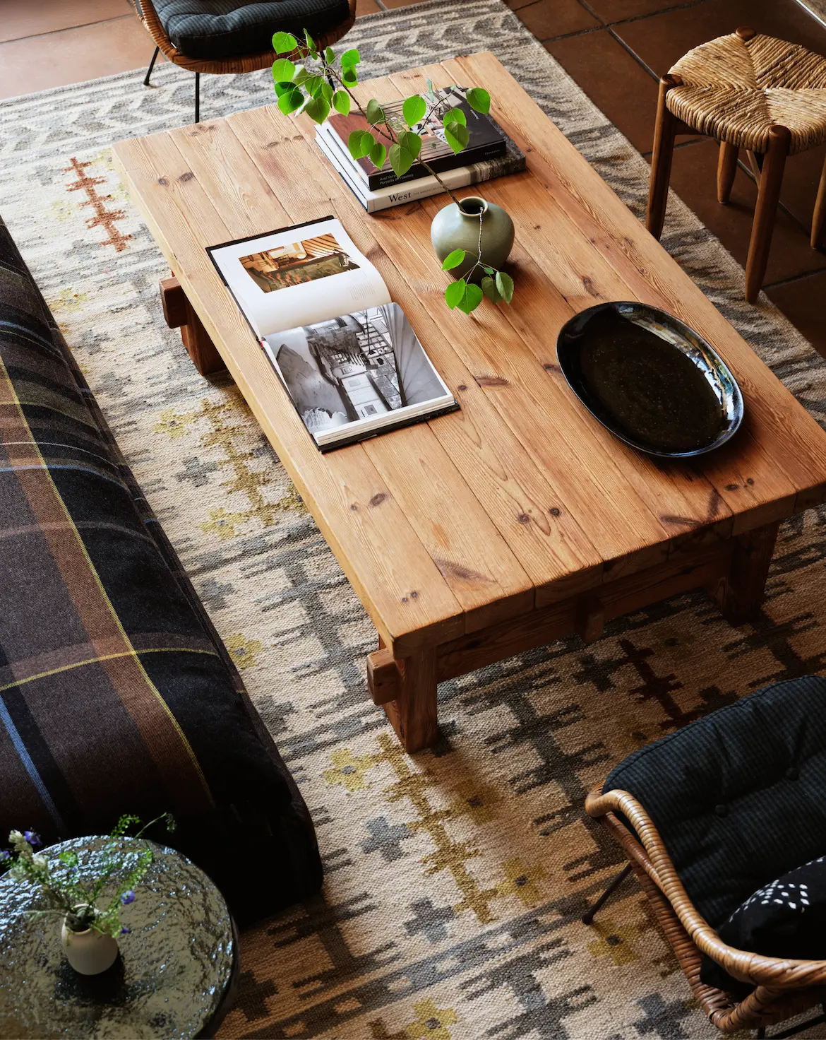
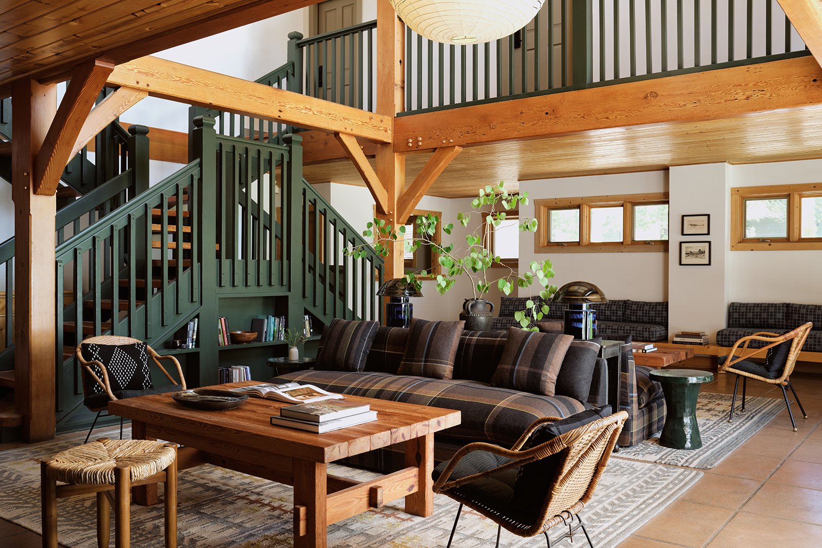
A significant factor in why the Alpine House feels distinctively residential rather than commercial is the eclectic mix of furnishings selected by Elizabeth Roberts Architects. Rather than relying on uniform, catalogue-ordered furniture suites for every guest room and common area, the studio curated a diverse inventory of vintage pieces and items from independent makers.
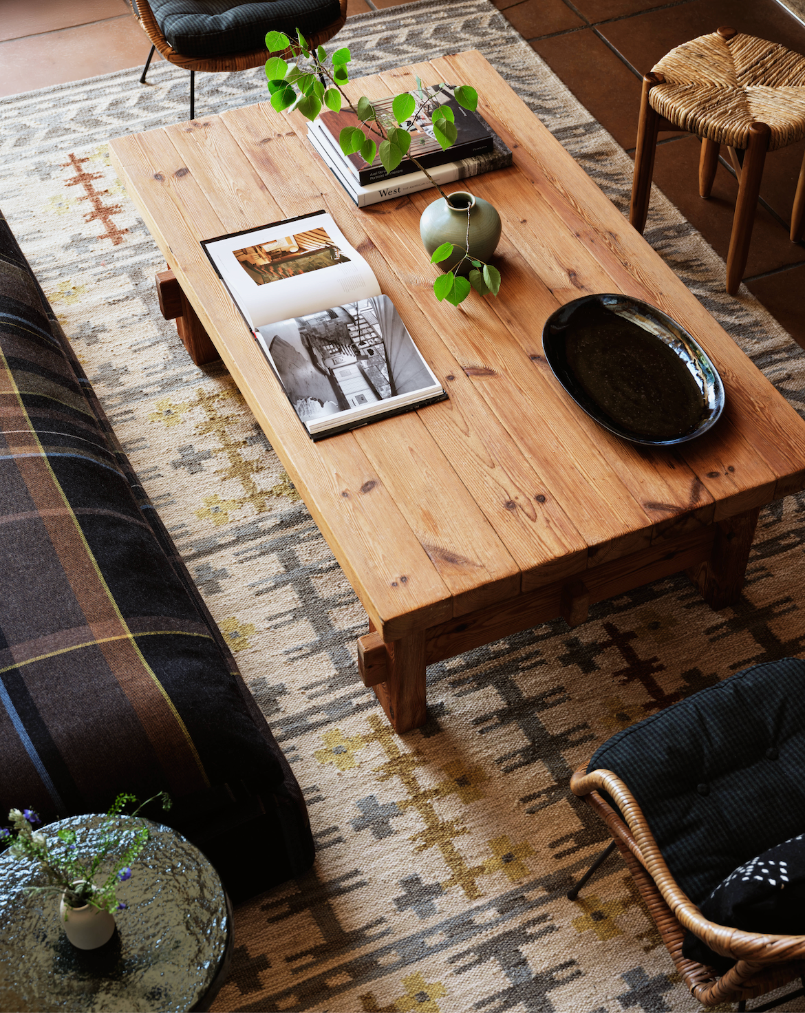
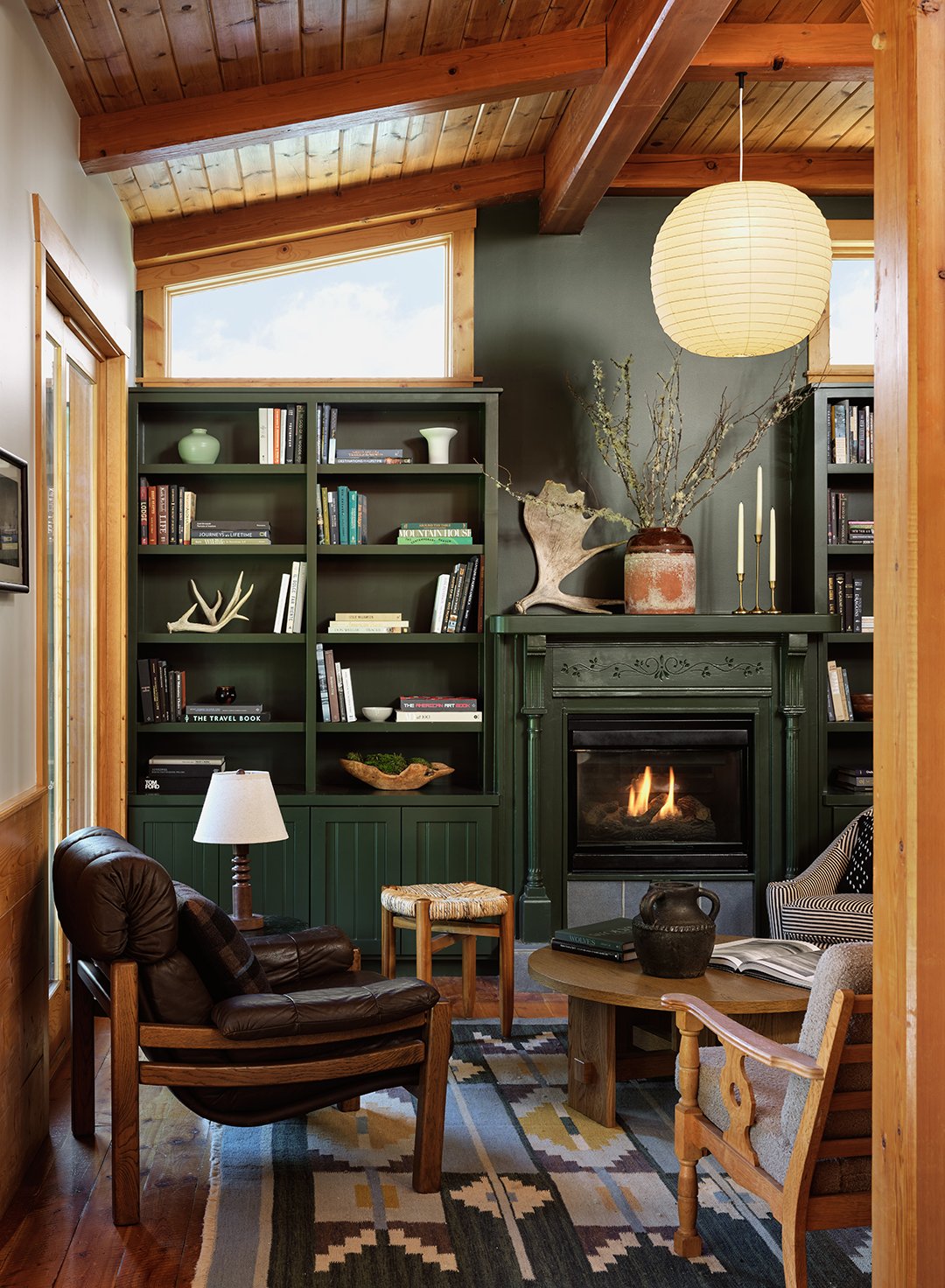
In the property’s library, for example, two vintage wood-frame chairs and a traditional rush stool sit alongside a contemporary coffee table sourced from Lulu and Georgia, all grounded by a vintage kilim rug found through Etsy. This deliberate juxtaposition of old and new, mass-market and one-of-a-kind, prevents the interior from feeling sterile and contributes heavily to the established "collected" aesthetic that Warner desired.
Build in a Banquette
The main public room of the hotel originally functioned primarily as a standard breakfast room filled with freestanding tables and chairs. When Roberts reconfigured the space to improve both flow and comfort, she chose to integrate a built-in banquette along the far wall to anchor the dining area.
This custom-built seating arrangement not only optimizes the floor plan by reducing the physical footprint required for seating, but it also creates a more intimate, anchored dining experience for guests. By trading loose furniture for custom built-ins, the design team maximized the usable square footage of the room while reinforcing the welcoming, domestic character of the property.