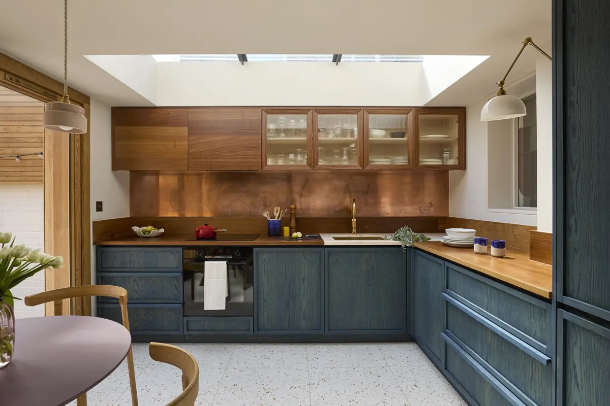
In a charming dwelling located in the West London district of Ealing, interior architect Anthi Grapsa took a homeowner’s favorite color and pushed it to its absolute limits. The result is a residential space that feels just as rich in tactile texture as it is in distinct personality, featuring vibrant splashes of color and carefully curated materials that cascade throughout the entire multi-level home.
The homeowner, a busy professional working in the music industry who frequently travels for work, had originally purchased the property a few years prior. Despite its potential, the house suffered from dated interiors and a disjointed ground-floor layout that failed to provide a sanctuary for unwinding after long trips or a welcoming environment for hosting friends and industry colleagues. Seeking a complete spatial reimagining, the owner brought in Grapsa to overhaul the residence. Over the course of a rigorous, year-long renovation, the designer replaced a poorly insulated, substandard rear glass extension with a bright, light-flooded kitchen, opened up the primary living spaces to better engage with the outdoor patio, and delivered a cohesive, much-needed aesthetic refresh.
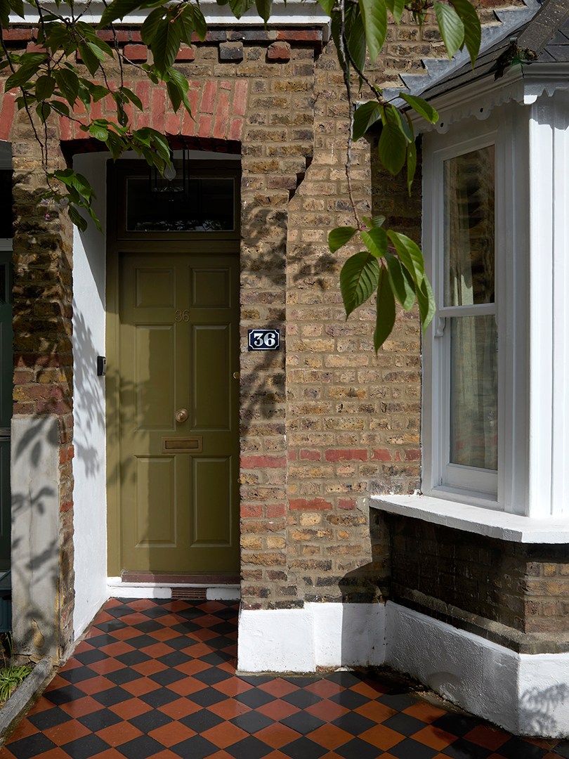
While the kitchen’s saturated cabinet fronts serve as a primary visual anchor, they compete for attention with an array of clever architectural details. These include a custom-designed etched-glass interior window and circus-inspired wallpaper tucked away in a discreet powder room. Grapsa recently reflected on the intricate renovation process, the intentionality behind her unexpected color combinations, and why the most successful interior design choices often require looking far beyond conventional palettes.
Rethinking Flow and Function on the Ground Floor
At the core of the project were clear functional goals aimed at transforming how the homeowner lived day-to-day. The primary priority was to completely rethink the ground-floor plan to establish a more social, cohesive footprint that maximized the utility of the adjoining rear patio.
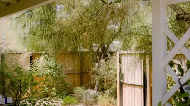
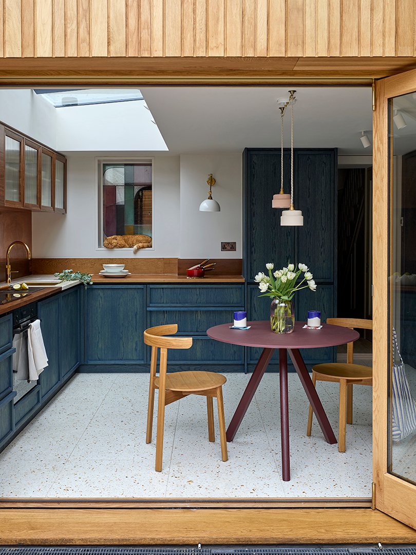
The original structure featured a small glass extension at the back of the cottage that suffered from poor construction and inadequate thermal performance. Grapsa and her team demolished this problematic addition, replacing it with a robust new structure that fundamentally altered the home’s rear elevation. By opening up the back of the house, the designer successfully bridged the gap between the kitchen, the dining space, and the outdoor patio, creating an uninterrupted indoor-outdoor flow that makes entertaining effortless.
The overarching design objective was to cultivate a calm, restorative retreat where the client could recharge in solitude or seamlessly transition into hosting gatherings. Natural materials and deeply saturated color palettes were deployed strategically to infuse the domestic architecture with warmth, character, and emotional depth.
Breathing New Life Into Salvaged Materials
One of the defining hallmarks of the Ealing home renovation is its thoughtful integration of reclaimed and salvaged materials, which sit comfortably alongside sleek, modern finishes. Rather than relying entirely on brand-new stock, Grapsa scoured specialized sources to find elements with historical resonance.
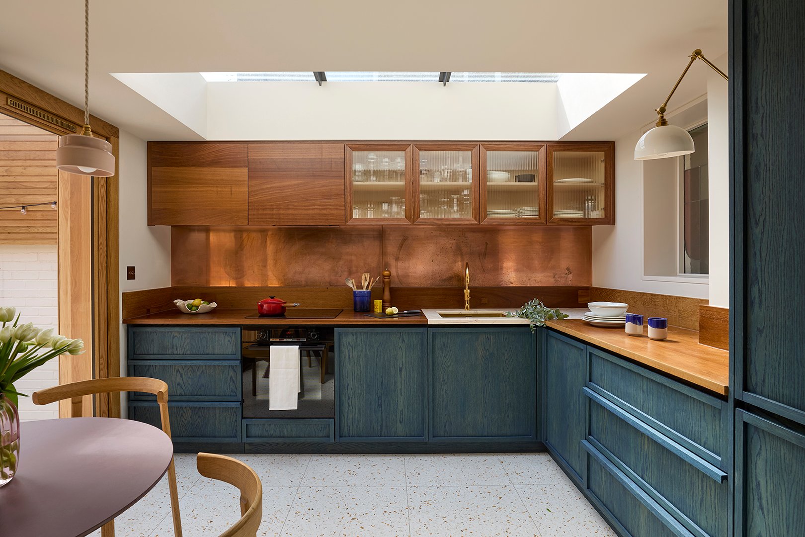
For the kitchen preparation surfaces, the design team repurposed reclaimed iroko wood sourced directly from old school laboratory worktops, giving the durable timber a completely unexpected second life in a residential setting. Additionally, Grapsa leveraged her professional network to secure a remnant piece of high-grade marble from a stone supplier she frequently collaborates with. This slab was custom-fitted around the kitchen sink, providing a highly practical, waterproof, and durable surface area for wet-zone tasks.
Rather than tearing out and replacing the home’s original pine flooring, the project prioritized repairing and refinishing the existing boards. This approach not only preserved the structural integrity of the historic cottage but also introduced an authentic patina. According to Grapsa, mixing salvaged elements with contemporary finishes prevents an interior from looking overly polished, sterile, or predictably new, anchoring the design in a sense of time and place.
The Chemistry of Color: Blue Millwork and Copper Tones
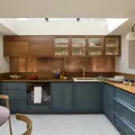
The decision to feature blue cabinetry in the kitchen stemmed directly from the homeowner’s personal affinity for the shade. Because natural light pours into the newly constructed kitchen extension through a generous overhead skylight, the space could easily handle a darker, more saturated hue without feeling claustrophobic or dim.
Instead of applying a flat, opaque paint, Grapsa opted for a specialized blue wood stain on the oak cabinetry. This technique allows the organic grain of the oak to remain visible through the pigment, generating subtle tonal variations that shift from bright cerulean to deep navy depending on the angle of the natural light.

To temper the cool undertones of the blue millwork, the designer introduced a warm copper splashback. The rosy, metallic reflections of the copper soften the visual temperature of the kitchen, while durable terrazzo flooring adds yet another layer of tactile complexity underfoot.
For homeowners looking to replicate such a bold color commitment, Grapsa advises looking at the composition holistically rather than obsessing over a paint swatch in isolation. Evaluating how materials, surface textures, lighting conditions, and existing furnishings interact with a primary color is critical. She strongly recommends testing physical samples directly within the target space, noting that shifting light conditions can drastically alter perception.
Defying Conventions with Ceilings and Trim
In the study, which doubles as a flexible guest bedroom, Grapsa subverted traditional interior norms by leaving the walls neutral and saturating the architectural boundaries instead. The client’s primary desire for the room was an atmosphere characterized by lightness and airiness.
To achieve this without resorting to a completely bland aesthetic, Grapsa applied a rich, earthy red—Rouge II by Paint & Paper Library—exclusively to the ceiling, window frames, doors, skirting boards, and architectural trim. This inversion of standard painting practices creates a dramatic framing effect that adds structural depth and definition while allowing the perimeter walls to remain bright and reflective. The result is a versatile, character-filled space that easily shifts between a focused workspace and a comfortable lodging for overnight visitors.
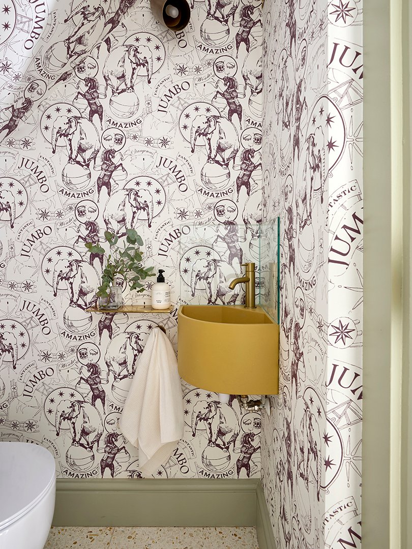
Further embracing unconventional design choices, the powder room tucked beneath the stairs serves as an immersive jewel box. Smaller rooms, Grapsa notes, present ideal opportunities to take calculated risks with intense color and pattern without disrupting the visual harmony of the larger house. The powder room features Jumbo wallpaper by British designer Daniel Heath, showcasing whimsical, theatrical imagery inspired by Victorian-era circuses.
Similarly, the removal of a traditional doorway between the kitchen and the dining area created an opening that was partially closed up during the replanning phase. To maintain sightlines and allow natural light to travel freely from the front of the house to the rear patio, Grapsa designed a custom etched-glass window. Composed of geometric straight and curved lines utilizing a color palette drawn from the home’s broader interior scheme, the glass panel provides a soft degree of privacy while casting a warm, textured ambient glow across both rooms as evening falls.
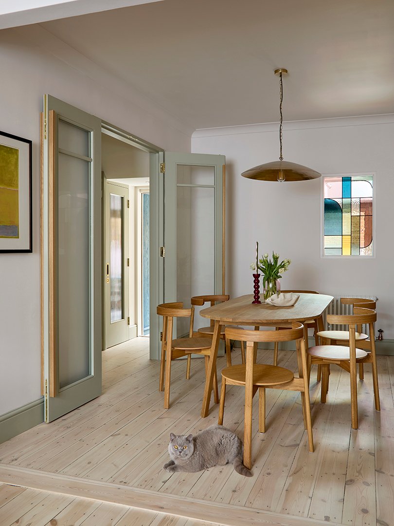
Ultimately, the completed London residence reflects a deeply personal collaboration between architect and client, punctuated by quiet, lived-in details—including a resident ginger cat who has claimed the sill of the custom etched-glass window as its permanent afternoon vantage point.