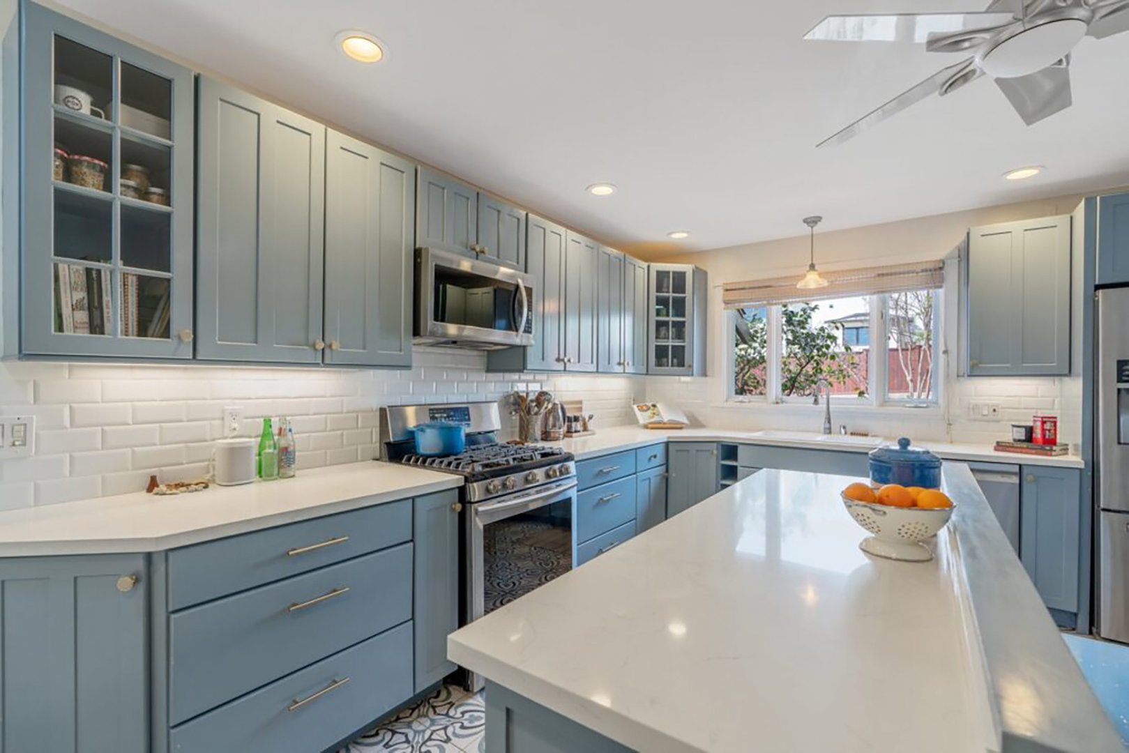
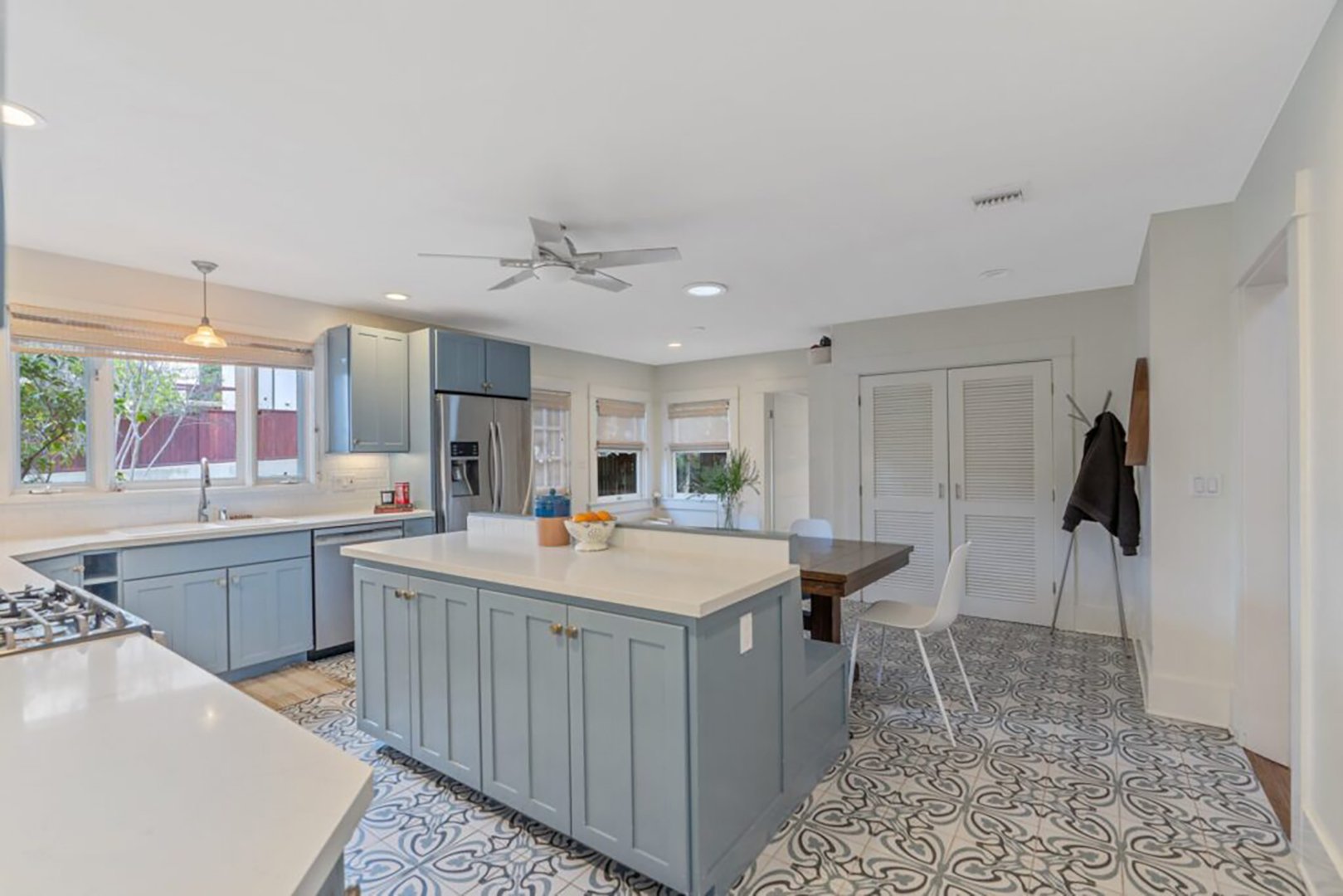
"It was a pretty tragic representation of the 2010s," recalls Blazek of the previous design choices.
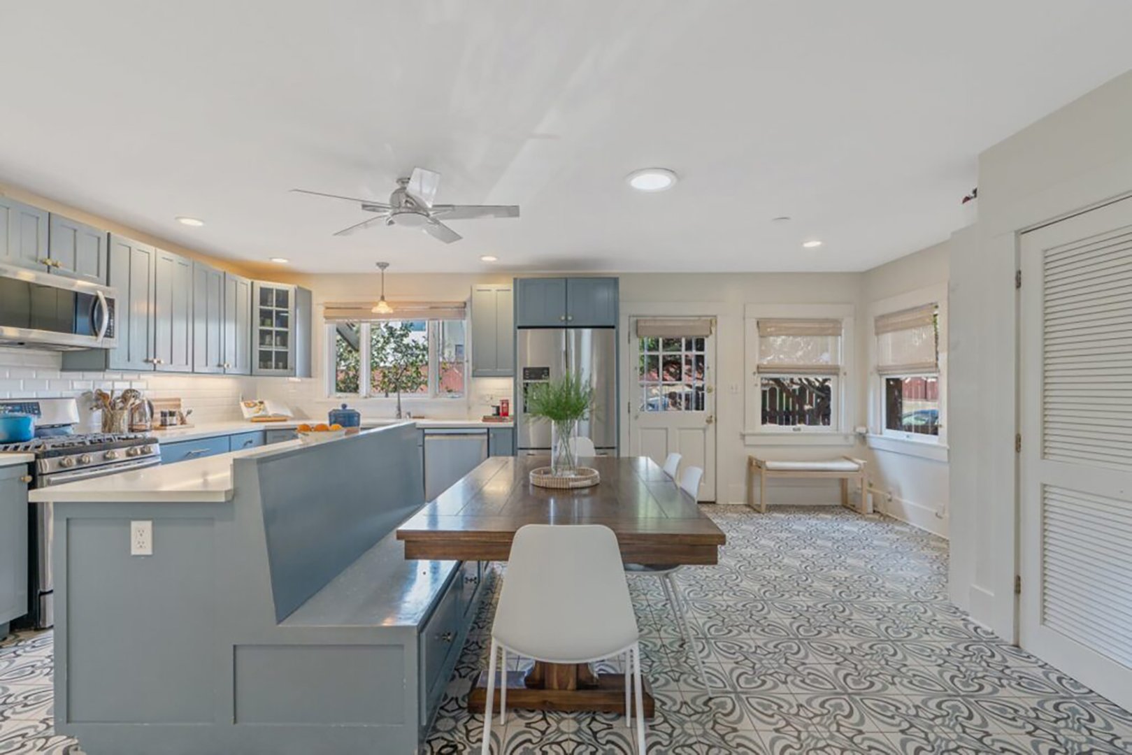
The kitchen was sorely out of place within the broader context of the residence. The Craftsman bungalow itself was built back in 1927, and despite decades passing, it still retained classic, artisanal architectural details like warm-wood paneling and sturdy built-ins. Yet, the kitchen stood as a jarring, awkward contrast of baby blue cabinetry and aggressively patterned floor tiles that fought against the home’s historic integrity.
"These clients came to me hating their kitchen," Blazek says, reflecting on the initial state of the project.
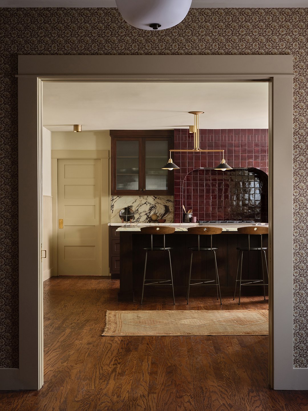
It was easy to see where things had gone awry for the previous owners. Instead of embracing the home’s historical lack of natural light, the past inhabitants tried to fight it by forcing a bright, contrasting color palette that felt sterile and misplaced. This time around, everyone involved was fully on board to lean into the darkness and honor the moody, rich character appropriate for a 1920s bungalow. Here is a closer look at how the designer managed to give this historic Los Angeles home the thoughtful, cohesive redo it truly deserved.
Stay Timeless with a Tonal Palette
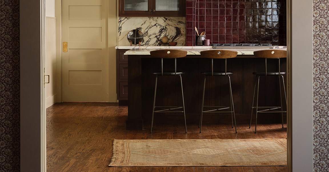
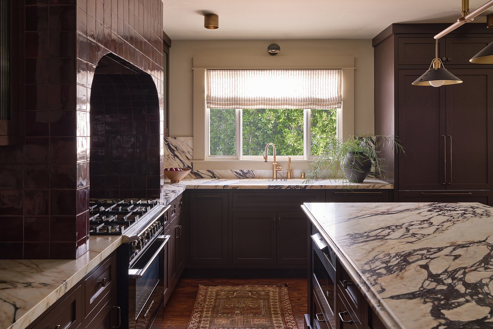
Blazek and the homeowners knew early on that they did not want to touch the existing cherry-wood paneling found in the adjacent dining room, which remained clearly visible from the kitchen space. Knowing that dark, rich tones were the key to achieving visual harmony, Blazek sought to find specific color shades that would build a natural bridge and cohesion between the home’s past and its present incarnation.
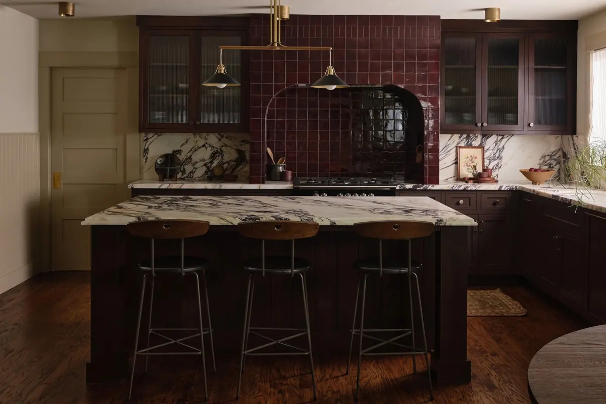
This vision came to life through details like the range alcove’s striking burgundy tilework and the sophisticated two-tone brown cabinets. To achieve the right texture and depth on the cabinetry, the bottom units were painted in Nomad by Dunn-Edwards, while the upper cabinets were carefully stained to match, allowing the natural wood grain to show through subtly rather than being completely masked by paint.
"The fewer the components, the bigger the impact," Blazek says, explaining her philosophy of rarely opting for stark, jarring contrasts in historic spaces. "If there is a contrast, it’s the slab."
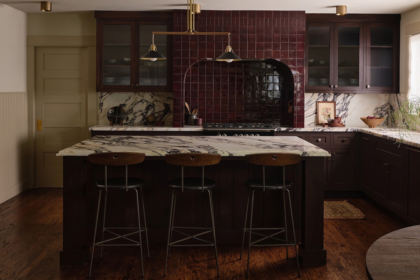
While the natural movement and dramatic swirls found within the honed Calacatta Viola Italia marble countertops are undeniably bold and loud, they tie the entire room together by successfully echoing the rich undertones of the surrounding walls and newly finished cabinet colors.
Break From the Past Where It Counts
While Blazek was deeply committed to ensuring the kitchen respected and reflected its century-old surroundings, she was equally mindful of modern livability. She deliberately selected elements like a brass-and-leather island chandelier and a sleek metal dining pendant, recognizing that no contemporary homeowner actually wants to inhabit a stuffy, unlivable museum exhibit.
"I try not to be too referential with lighting," she notes, explaining the balance between period-appropriate charm and modern functionality. "If they have clean lines, they’ll work anywhere."
To supplement the decorative fixtures, practical brass spotlights were integrated into the ceiling layout to offer targeted, highly functional illumination during food preparation without detracting from the overall aesthetic integrity of the room.
Get Cozy in the Corner
One of the most significant spatial shifts in the entire project involved addressing a very awkward layout choice left behind by the previous owners. Originally, the washing machine and dryer had been awkwardly tucked away inside a utility closet positioned directly behind the kitchen island. Blazek completely nixed that outdated arrangement, choosing instead to carve out space to establish a functional, dedicated mudroom area.
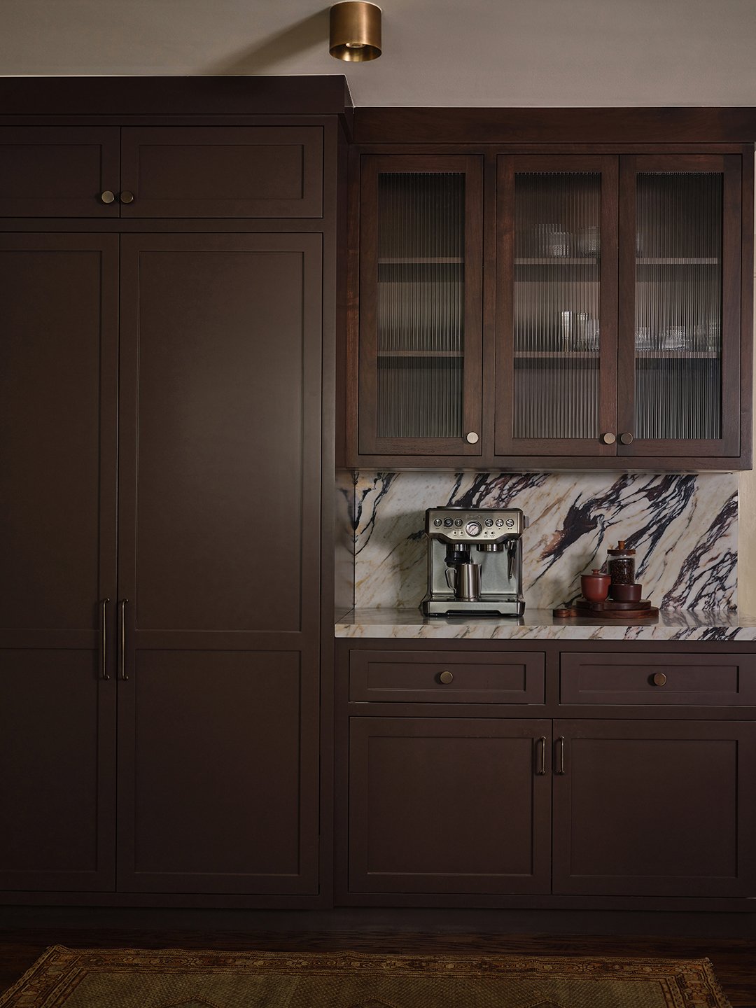
With those bulky laundry appliances entirely out of the picture, she was able to open up the floor plan to incorporate comfortable banquette seating alongside a custom pantry complete with an integrated coffee station.
Relegating the new dining zone to the most sun-drenched corner of the kitchen floor plan made immense practical and architectural sense on multiple levels. Not only does it provide a pleasant view while eating meals, but it also preserves the home’s original assets.
"The two existing windows above the banquette were in good condition, so it didn’t make sense to remove them for more cabinets," Blazek explains. "This configuration gives them the extra space they need for everyday items and casual seating, without sacrificing natural light."
Rather than gutting everything, the designer held on to the original wide trim surrounding the windows, but added authentic character to the surrounding walls by installing new beadboard paneling. Both elements feel entirely true to the classic Craftsman architectural aesthetic, even if the application is a few decades late to the original construction date.
"The beadboard adds depth, too, instead of just being one-dimensional drywall," she points out. The finishing touch ensured that the new additions blended seamlessly, avoiding the common renovation pitfall of introducing modern materials that fail to fit in.