"It was a pretty tragic representation of the 2010s," recalls Blazek, who founded the interior design firm a1000xbetter.
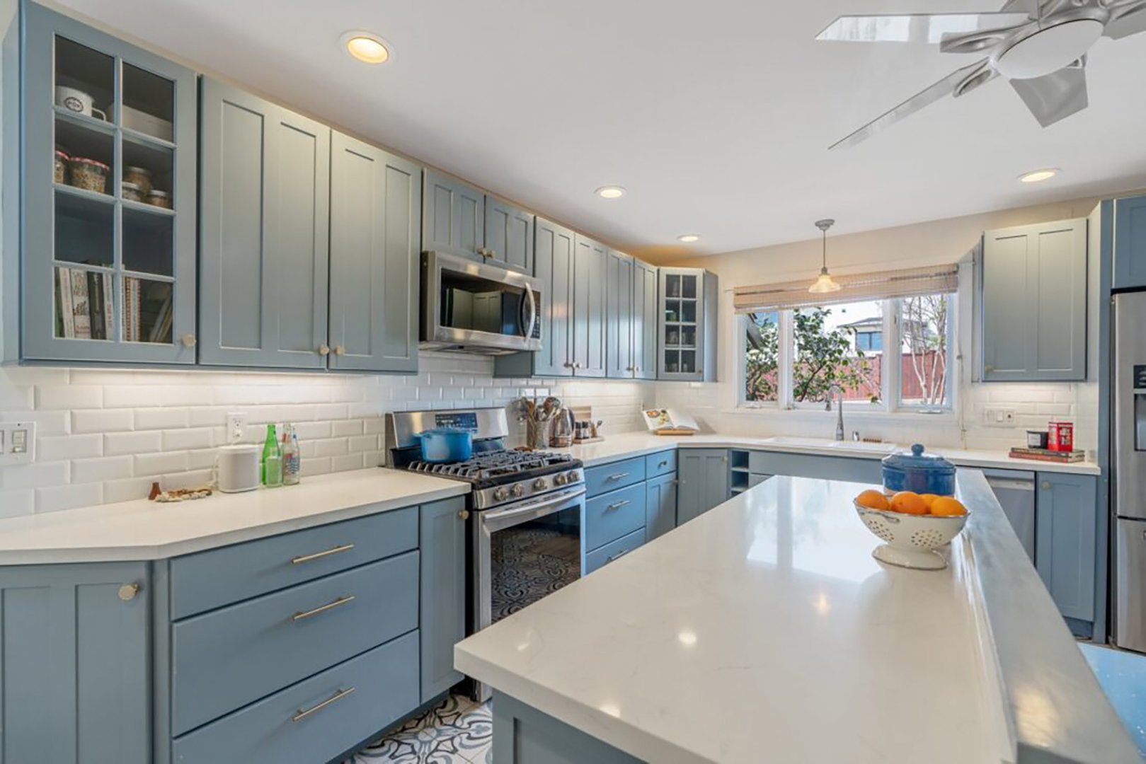
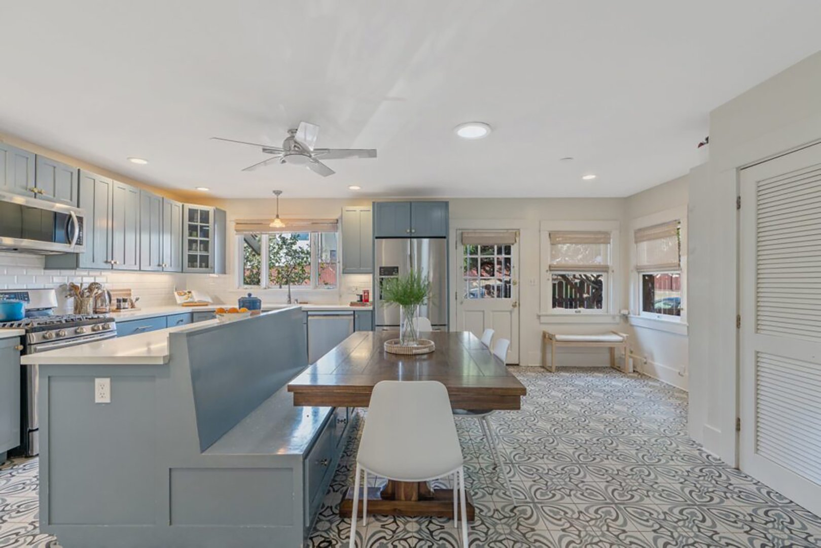
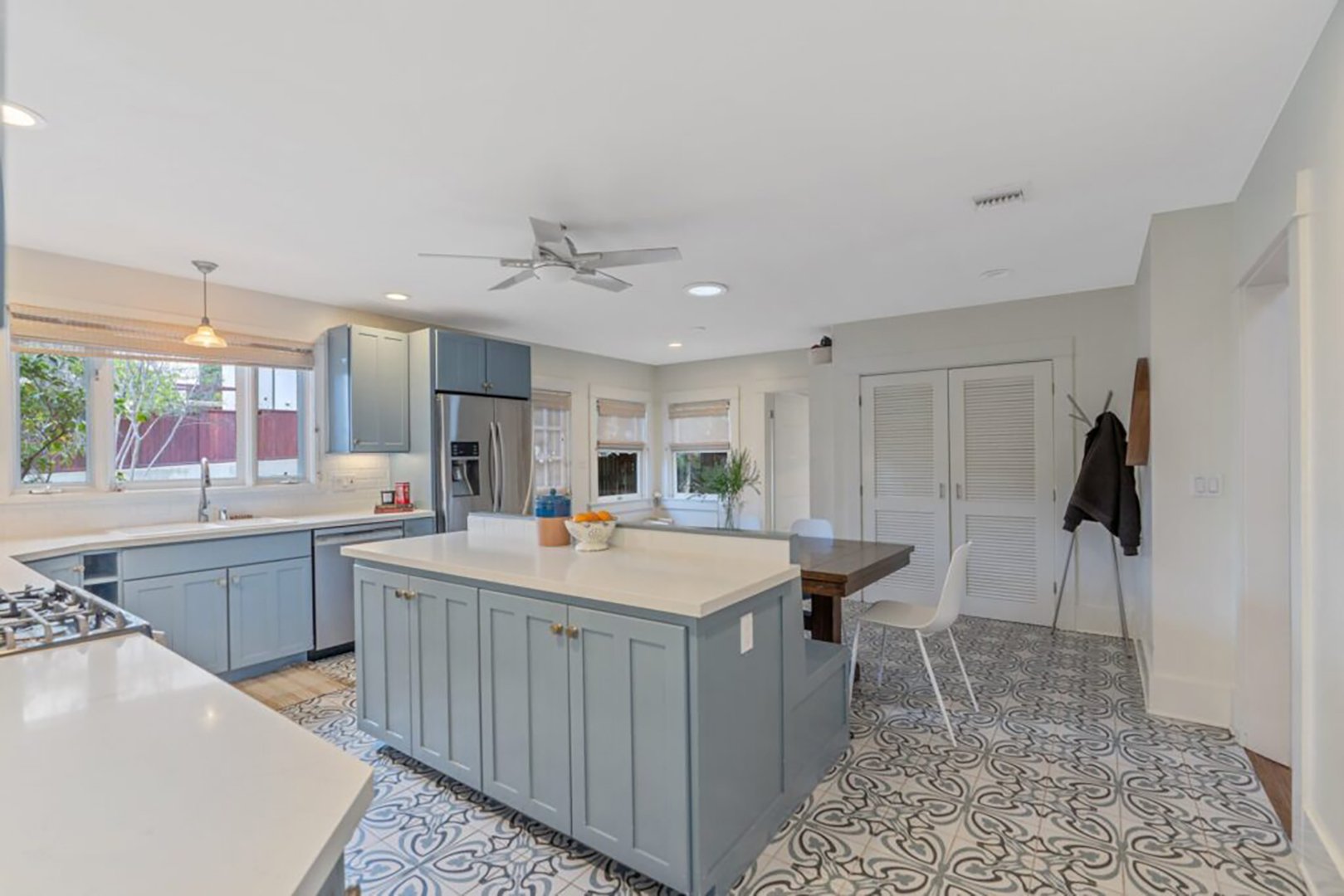
The kitchen was sorely out of place within the historic framework of the property. The Craftsman bungalow was originally built in 1927 and still retained its classic, architectural details throughout the rest of the floor plan, including warm-wood paneling and sturdy built-ins. Yet, the kitchen stood as a jarring contrast of baby blue cabinetry and aggressively patterned floor tiles that fought against the home’s historic identity.
"These clients came to me hating their kitchen," Blazek says.
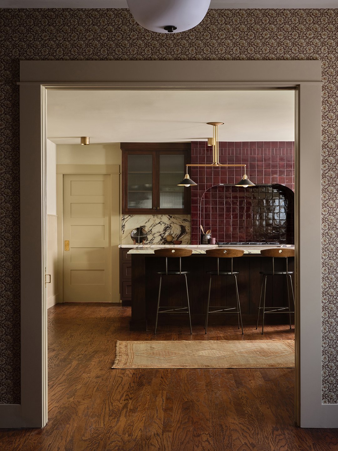
It was easy to see where things had gone awry during the previous intervention. Instead of embracing the home’s inherent lack of natural light in certain interior zones, past owners had tried to forcefully correct it with an ill-fitting, overly bright pastel palette. This time around, everyone involved was completely on board to lean into the darkness rather than fight it. Through a thoughtful combination of tonal depth, strategic spatial reconfiguration, and a deep respect for historical architecture, Blazek gave the home the sensitive and sophisticated redo it truly deserved.
Stay Timeless with a Tonal Palette
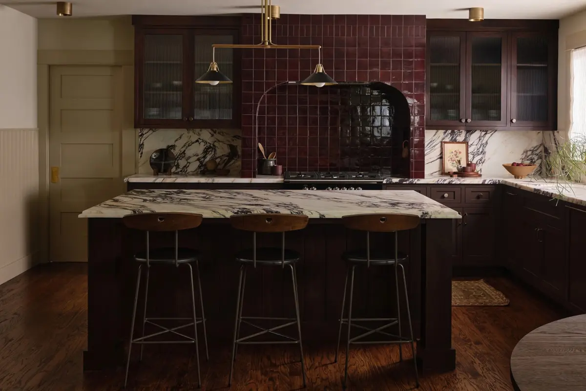
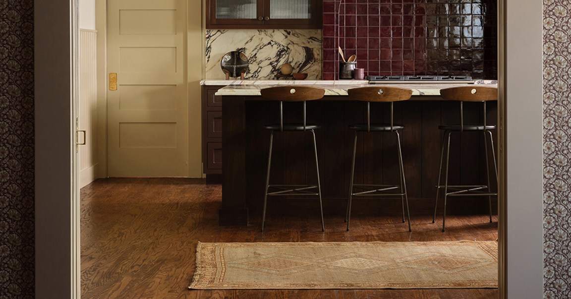
When Blazek and the homeowners assessed the broader interior landscape, they quickly realized they did not want to touch the existing, rich cherry-wood paneling in the adjacent dining room, which remained fully visible from the kitchen space. Knowing that dark, grounding tones were the key to achieving visual harmony, Blazek sought to find specific colorways and materials that would build a seamless bridge between the home’s past and its present incarnation.
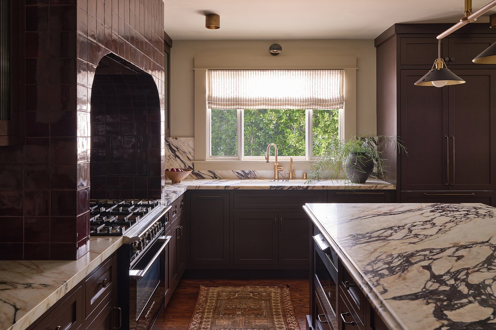
This design philosophy led to the incorporation of striking burgundy tile inside the range alcove, paired with sophisticated two-tone brown cabinets. To achieve the exact texture and finish she envisioned, the lower cabinets were painted in Dunn-Edwards’s Nomad, while the upper cabinets were stained to match, allowing the natural wood grain to show through subtly rather than being masked under heavy layers of opaque paint.
"The fewer the components, the bigger the impact," Blazek says, explaining her general aversion to stark contrasts in historical spaces. "If there is a contrast, it’s the slab."
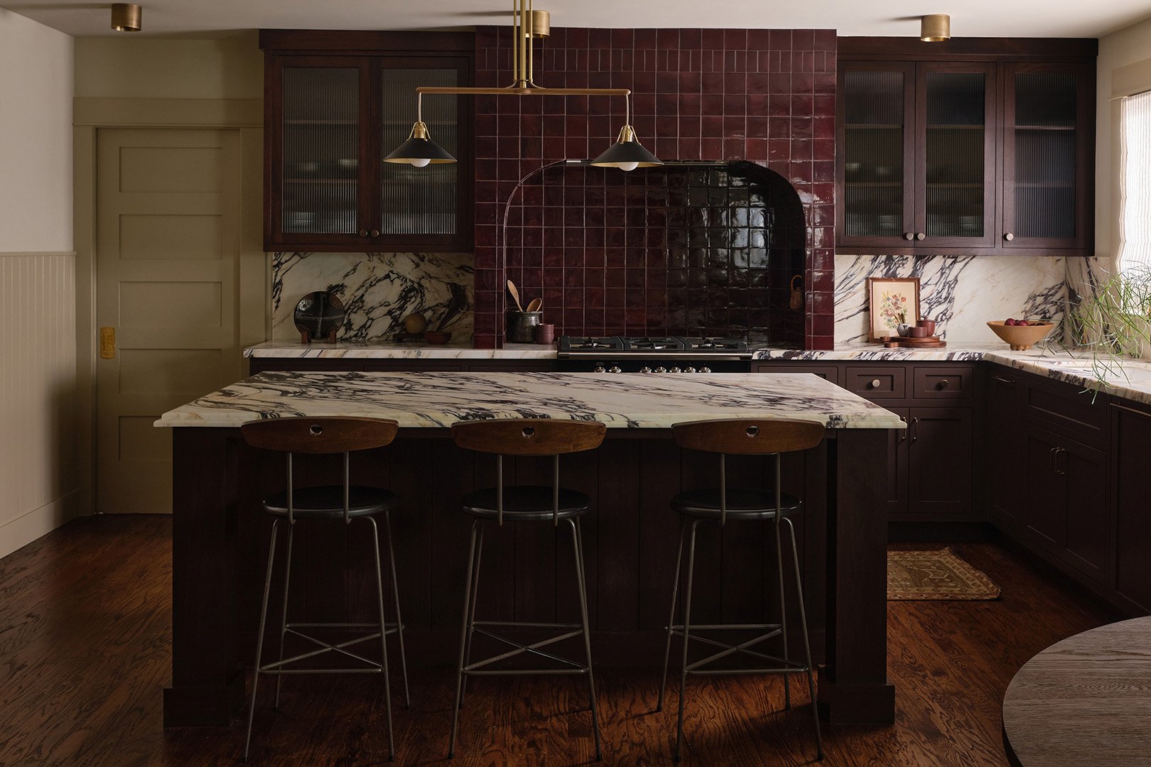
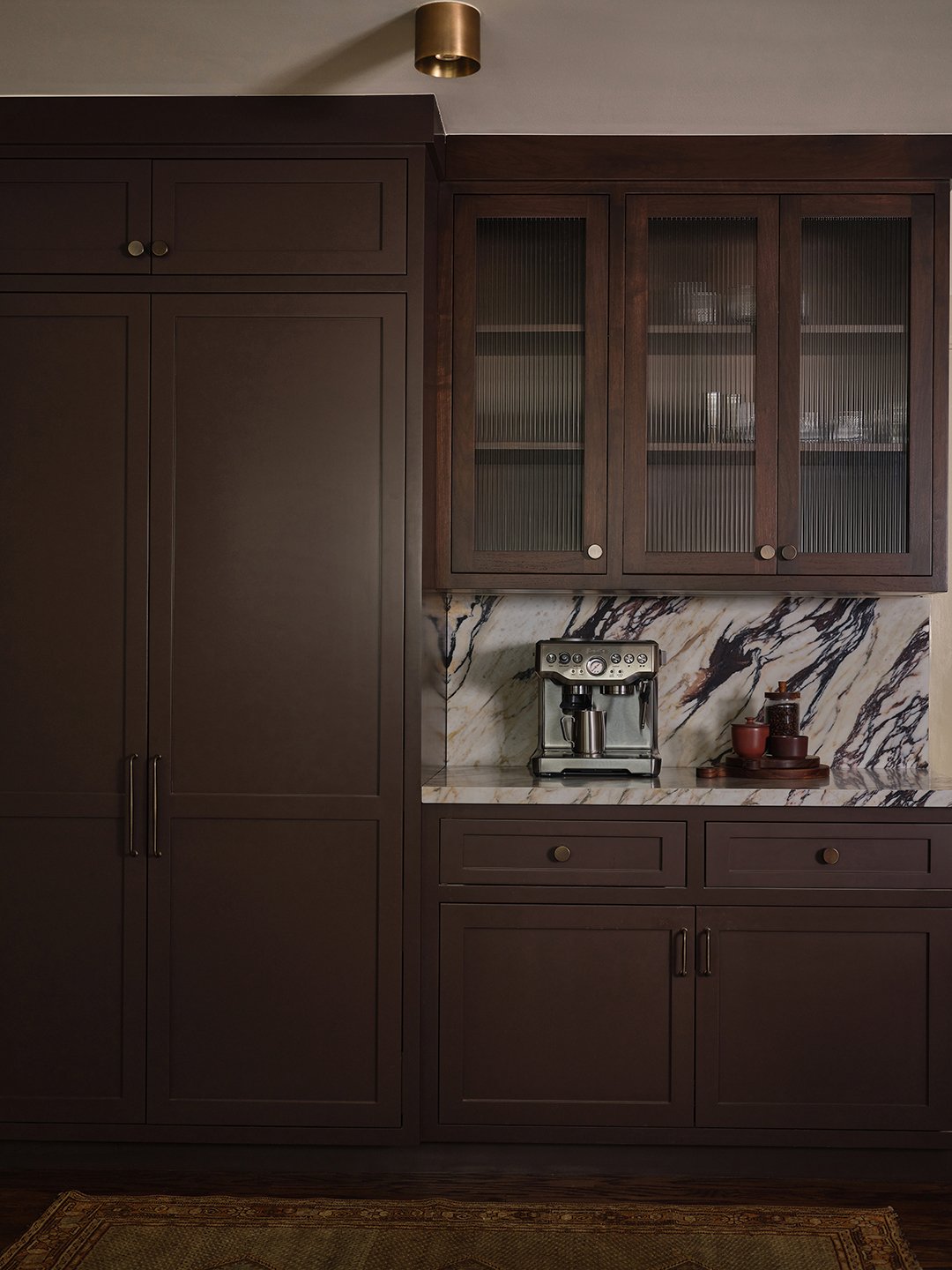
While the dramatic, sweeping swirls within the Calacatta Viola Italia honed marble countertops and backsplash are undeniably bold, they pull in the rich undertones of the surrounding walls and cabinet colors, anchoring the room without creating visual chaos. The walls themselves were finished in Wool Skein by Sherwin-Williams, creating a warm, enveloping backdrop that complements the deeper cabinetry and tile selections. Hardware from Plank Hardware in antique brass adds a quiet, period-appropriate metallic touch, while a traditional rug from Mehraban softens the hardwood floors.
Break From the Past Where It Counts
While Blazek wanted the kitchen to reflect its century-old surroundings, she was careful not to replicate a museum environment where modern inhabitants would feel uncomfortable. To prevent the space from feeling too stiff or historically literal, she selected contemporary fixtures with clean, minimal lines, such as a brass-and-leather island chandelier from RTO, metal dining pendants, and subtle brass spotlights.
"I try not to be too referential with lighting," she notes. "If they have clean lines, they’ll work anywhere."
These elements provide practical, layered task and ambient illumination without detracting from the overall architectural narrative. Similarly, modern plumbing fixtures, including a sleek faucet from California Faucets and a wall sconce from Lostine, bring contemporary functionality to the historic workspace, ensuring that the kitchen performs at a high standard for its busy, professional occupants.
Get Cozy in the Corner
One of the most significant spatial improvements of the entire renovation involved rethinking the room’s layout and utility spaces. Previously, a washer and dryer were awkwardly tucked into a closet directly behind the kitchen island, disrupting the flow and utility of the central prep area. Blazek nixed that setup entirely, carving out dedicated space to establish a functional, organized mudroom elsewhere.
With those bulky appliances out of the picture, she was able to open up the floor plan to introduce custom banquette seating and a spacious pantry complete with an integrated coffee station. Relegating the new dining zone to the most sun-drenched corner of the kitchen made immediate practical sense. Not only does it provide a comfortable place to sit and converse, but it also maximizes the utility of the existing architecture.
"The two existing windows above the banquette were in good condition, so it didn’t make sense to remove them for more cabinets," Blazek explains. "This configuration gives them the extra space they need for everyday items and casual seating, without sacrificing natural light."
Rather than gutting the window frames to maximize upper wall storage, Blazek held on to the original wide trim surrounding the windows. She then added architectural character to the surrounding walls with new beadboard paneling painted in Relaxed Khaki by Sherwin-Williams. Both elements feel entirely true to the Craftsman aesthetic, even if the execution brings a fresh, updated perspective to the century-old dwelling. Upholstered in a durable fabric from Glant and accompanied by a table from Restoration Hardware and chairs by Rachel Donath, the cozy corner serves as a gathering spot for the family.
"The beadboard adds depth, too, instead of just being one-dimensional drywall," she says.
In the end, every design decision was filtered through the lens of appropriateness and longevity, ensuring that the newly renovated kitchen looks as though it has belonged in the 1927 bungalow all along.