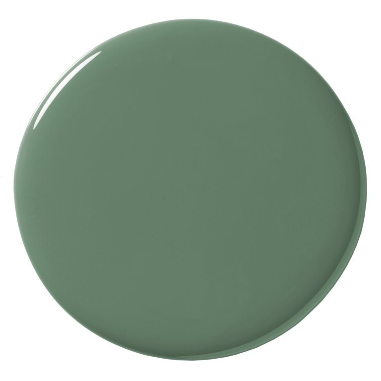
For many, if asked to close their eyes and picture a pure, unadulterated green, the resulting mental image would match the chosen swatch. Webster Green lacks the glaring, loud undertones of neon or the heavy, muted grayness that characterizes many modern pastels. It is neither overwhelmingly bright nor oppressively dark. Instead, it strikes a balance that interior designers and color theorists alike would categorize as classic.
Arianna Barone, color marketing manager at Benjamin Moore, notes that the selection process intentionally avoided leaning too heavily into nostalgia-driven aesthetics. The team wanted to bypass shades that immediately evoke specific bygone eras, such as the roaring stylistic revivals of the 1920s or the mid-century statements of the 1960s. Instead, the objective was to anchor the palette in a color that feels effortlessly right and refreshingly contemporary for modern living spaces, ensuring it remains timeless rather than dated.
Where to Use It
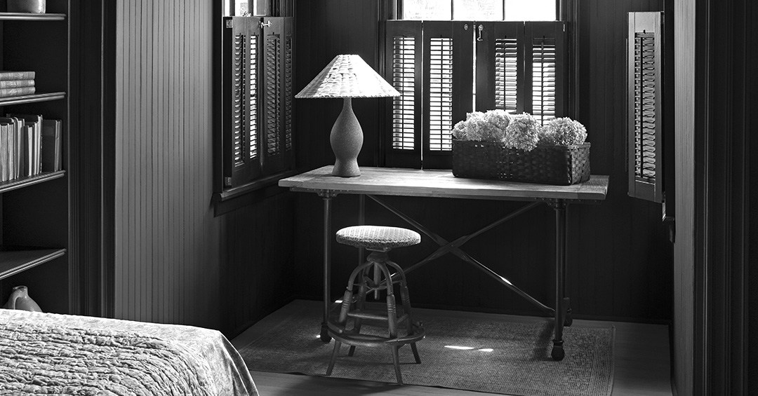
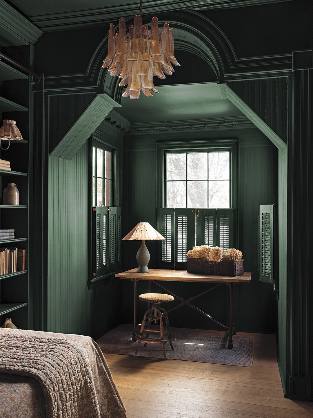
Unlike many newly formulated colors of the year that are engineered specifically to capture fleeting market attention, Webster Green is not a newcomer. It is an established shade pulled straight from Benjamin Moore’s esteemed Historic Color Collection. Because of its traditional roots, it naturally feels at home in architectural spaces rich with character and historical detail. It shines particularly well in living rooms featuring prominent fireplace mantels, bathrooms adorned with classic wainscoting, or bedrooms accented by intricate ceiling medallions.
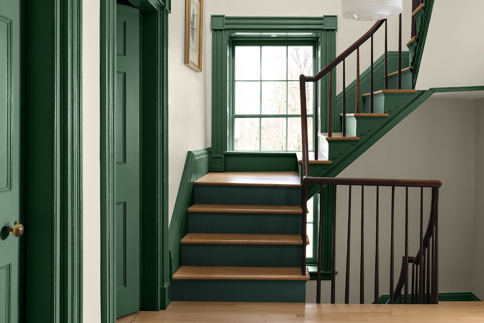
Rather than defaulting to standard applications, design professionals are experimenting with ways to invert traditional color placements. One favored approach involves flipping the script by painting ornate trim, crown molding, and architectural millwork in Webster Green while keeping the surrounding walls a soft, creamy off-white. When applied to elaborate woodwork, the saturated hue serves as a visual guide, gently leading the eye around the perimeter of the room and highlighting craftsmanship that might otherwise blend into a neutral background.
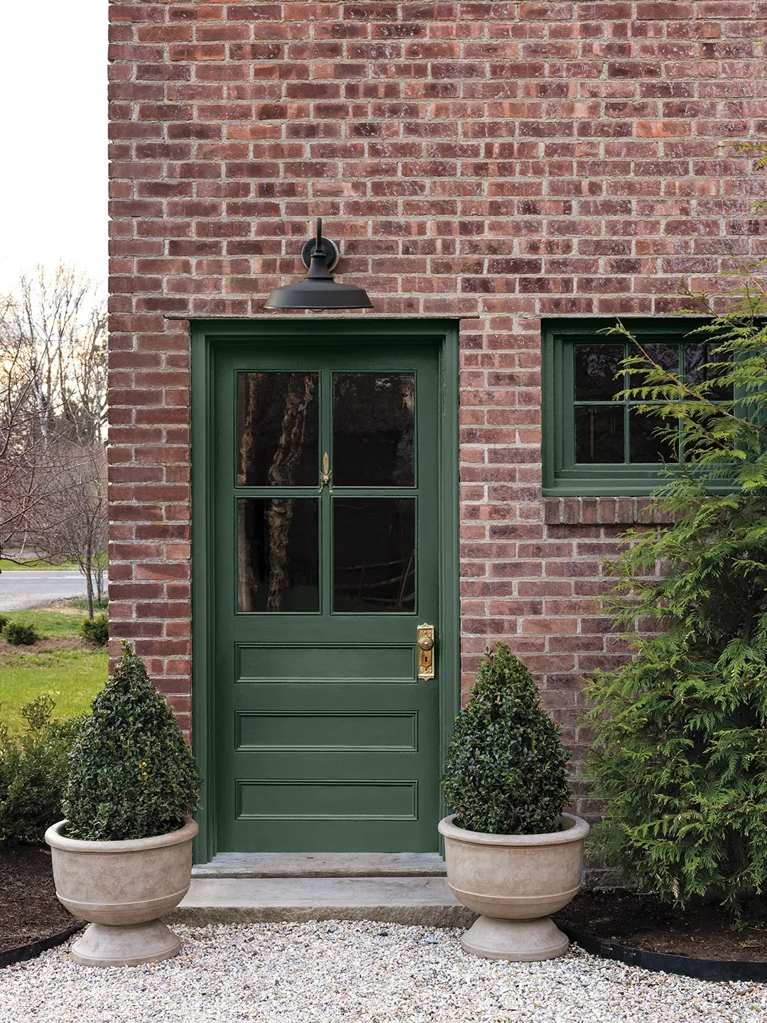
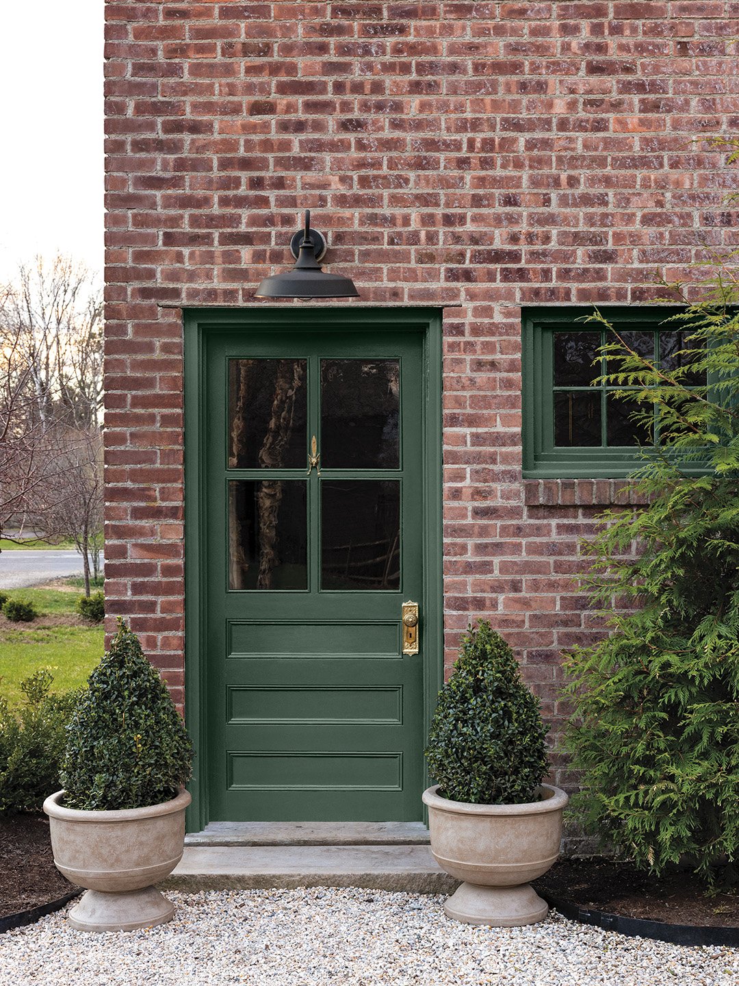
Exterior applications offer another compelling avenue for the hue. For homes featuring classic red or multi-toned brick facades, Webster Green provides a sophisticated and refreshing contrast when used on front doors, shutters, and window frames. This application taps into the universally appealing, highly complementary visual balance between deep red masonry and rich, earthy green vegetation.
What Colors to Pair with It
Building a cohesive palette around a dominant saturated color requires careful coordination, and Benjamin Moore’s broader 2027 color collection provides a reliable roadmap. Much like the flagship green, the supporting shades have been curated to avoid looking dated, offering a balanced foundation for various design schemes.
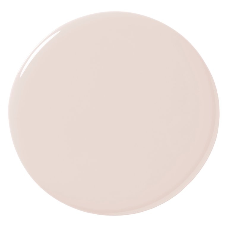
For those seeking a softer contrast to temper the depth of Webster Green, White Down serves as an effective off-white option infused with just enough cream to soften the transition. Homeowners looking to step away from traditional white ceilings in a deeply saturated room can consider Nelson Blue, a pale, atmospheric blue that introduces a subtle sky-like element while harmonizing effortlessly with warm woods and earthy terracotta tones like Antique Copper.
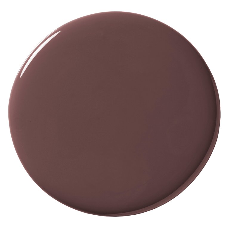
To amplify warmth within a space, Shakespeare Tan offers a golden neutral quality that shifts fluidly between amber and olive depending on the ambient lighting conditions. Meanwhile, those leaning toward a subtle, barely-there pink can look to Wild Aster, a delicate neutral described by the color team at Benjamin Moore as a quiet favorite. For richer, more enveloping environments, pairing Webster Green walls with Durango millwork satisfies an affinity for olive-toned brown, while the Historic Collection’s Townsend Harbor Brown introduces a grounded burgundy that anchors the entire palette.
Other Ways to Try Webster Green
Despite its status as a quintessential green, sourcing furniture and home decor accessories in this exact deep, balanced shade can present a slight challenge for shoppers. The retail market has largely saturated itself with trendier iterations like moss, sage, and chartreuse. However, with deliberate searching, design enthusiasts can unearth statement pieces that capture the essence of Webster Green.
Current offerings range from sleek round accent tables from collections like IKEA PS 2026 to ceramic table lamps featuring towering rectangular bases, such as Crate & Barrel’s ceramic green lighting options. Antique pieces, including 18th-century decorative green urns found through specialized vintage curators like Nickey Kehoe, offer inspiration for DIY projects involving a fresh can of paint. Additional accents like striped Roman shades and slim rolling utility carts in functional living spaces further demonstrate how the hue can be integrated into everyday interiors.
Ultimately, Webster Green’s elevation to Benjamin Moore’s Color of the Year for 2027 signals a broader shift away from temporary novelty and toward enduring style. By anchoring its future vision in a historic shade that bridges past architectural traditions with contemporary living, the brand is positioning green not as a fleeting trend, but as a permanent fixture in the modern home.